Experienced traders know that the most profitable moves occur in the direction of the long term trend. Whatever your trading style in the short term, you need to know the longer term trend in order to find the highest probability trading opportunities.
There are many ways to define a market’s trend.
We know that you will want to find the method that best fits your strategy and outlook, so that’s why we’ve created an indicator that lets you choose between five different trend identification methods, ranging from popular technical approaches to the more esoteric:
Classic Heikin-Ashi
Ancient Japanese charting method that eliminates the possibility of curve fitting trend analysis to historical data.
Modified Heikin-Ashi
Popularised by educator John Carter, this is a less sensitive algorithm that reduces whipsaw signals and can work well for day-traders.
Moving Average Directional Slope
In testing hundreds of strategies across dozens of markets, we have found that the slope of a simple moving average is one of the most reliable and robust indicators of trend.
Squeeze Momentum
The trend histogram component found in the Delphic Squeeze indicator calculates the delta of price from a channel’s mid-line to reveal the current trend.
DMI Trend
Key components of the popular ADX trend strength indicator, the DMI Plus and DMI Minus calculations provide low-latency information about both trend direction and strength.
Using Anchor Trends in your Trading
The principal trading application of the Delphic TradeStation Anchor Trend indicator is not to provide entry or exit signals, but to act as a trend reference in higher-timeframes. This is a smart way for day-traders to filter the countless signals that their strategies often generate, identifying only the highest probability trading opportunities that align with the market’s longer term direction.
The greater and more numerous price movements always occur in the direction of the longer-term trend (this is true by definition – a trend exists because the sum of the movements in that direction have been greater than those against it), so ‘anchoring’ yourself to these trends on higher timeframe charts always makes sense.
The process we will undertake is as follows:
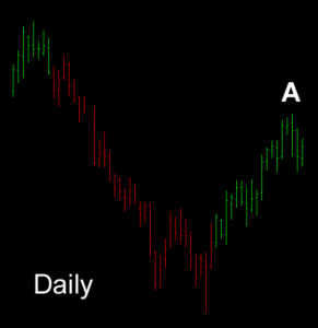
Select two higher timeframes to anchor your trades against. In this example we will take entry signals from a five minute chart, using both a daily and an hourly timeframe as our reference or ‘anchor’ charts. When trend signals in the two higher timeframes are aligned, we will then use this bias to filter signals from the five minute chart.
At Point A the Delphic Anchor Trend shows an uptrend on the daily chart of the British Pound.
 |
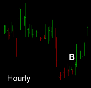 |
On the hourly chart we can see that the trend turns positive from around the time of the London open, at Point B. With this bullish alignment in the anchor charts, we will now accept only ‘buy’ signals from the five minute chart.
Our example entry technique is a pullback that causes a four-period RSI to close below 25 – you can see that this happens at each of the Points C, D, E, and F on the five minute chart below:
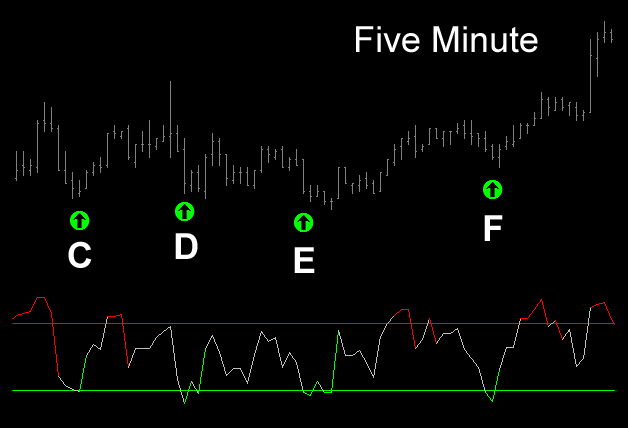
Notice how numerous short entries are also signalled by the RSI, none of which would have yielded any significant profits.
Heikin-Ashi – The Classic & Modified Approaches
Since they were introduced to the west several decades ago, candlestick charts and the analysis of their formations has become a commonplace of technical analysis, providing a popular method of assessing the bullish and bearish forces at play within a market.
But candlesticks are just a small portion of the trading knowledge to have emerged from Japan; Heikin-Ashi candlesticks are a powerful method for determining the current trend and strength of a market.
 The TradeStation Anchor Trend indicator includes two trend-determination methods based upon the ancient Japanese Heikin-Ashi charting technique.
Heikin-Ashi translates as “average bar”, and is a highly visual method for eliminating the irregularities of standard price charts.
Rather like range bars, traditional Heikin-Ashi candles filter out market noise to provide a clearer picture of trends and consolidations.
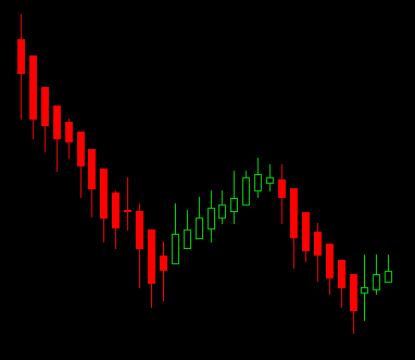
The picture to the left shows traditional Heikin-Ashi candlesticks applied to a chart of the Euro. The Heiken-Ashi approach minimizes noise to reveal the underlying trend.
Heikin-Ashi candlesticks are calculated from an average of the opening and closing prices using the formulas shown below.
HA Close = ( Open + High + Low + Close ) / 4
HA Open = ( Previous HA Open + Previous HA Close ) / 2
HA High = Maximum ( High, HA Open, HA Close )
HA Low = Minimum ( Low, HA Open, HA Close )
Because this comparative formula requires data from only the current and previous sessions, no variable look-back period is involved.
If you use techniques such as moving averages, it’s easy to pick the length that would have best defined the trends with hindsight, but in practice this can lead to over-optimization of a system’s parameters. Because the Heikin-Ashi method contains zero variable inputs, it is impossible to optimize its parameters. This means one less thing to worry about when developing your strategies, and the prospect of a more consistently profitable performance in real-time trading.
The Delphic Anchor Trend includes paint bar studies that color the normal bars or candles on your chart according to either the classic formula above, or a modification of this.
The modified version was made popular by trader and educator John Carter, and introduces a rule that rejects a change in trend when this produces a Heikin-Ashi ‘inside bar’. This makes the indicator slower to react to sudden trend changes, but can also mean fewer signals are produced during choppy, ranging markets. Which version is more appropriate to your trading will depend on your strategy or style of market analysis.
Pro-Trader TipsPRO TIP: The Delphic Anchor Trend really comes into its element when it is used to filter trends that are created by a counter-trend strategy in the shorter timeframe (buying a falling market, or selling a rising one, typically using limit orders). Counter-trend entries can be both profitable and dangerous; using the Anchor Trend greatly increases the probabilities that the movement you fade is only a brief correction within a long term trend. PRO TIP:Be aware of current short term tendencies in market behaviour, such as pre-market rallies or reversals into the close. Take delphic tradestation of them while they last, but be prepared to abandon them as soon as they show signs of failing. As Larry Williams says, day traders must be prepared to ‘spin on a dime’. “A day-trader still needs to know what the recent trend is and should then trade primarily from that direction” Marcel Link “The trend is your friend” Old Saying “The longer the period of accumulation, the greater the number of strong hands, and the larger the base from which prices can rise. The benefit of applying this type of analysis to the OBV indicator, rather than directly to the price, is that OBV weights each day’s price action with its trading volume and by doing so becomes a better measure of the relative participation behind the trend” Thomas Stridsman PRO TIP: Remember that not all strategies can be improved by using trend filters. Some things just ‘work’, and they work regardless of the longer term trend. Using strategies that are not trend-dependent alongside those that are can be a great way to smooth equity curves. PRO TIP: You should also give careful thought to precisely which higher timeframes are relevant to the one you’re aiming to trade – if you’re trying to scalp for a few ticks intraday, then the trend on the weekly chart probably isn’t that important! |
Entry Methods with the Modified Heikin Ashi
The following entry method is all about taking on greater perceived risk for greater potential reward. Entering after a pullback ends and the trend resumes is a reliable approach in many markets, but it is also a well-known one – when a clearly trending market retreats on low volatility many traders will enter on a thrust back in the direction of the trend.
How can we get ‘ahead’ of these traders with our entries?
The chart below shows the e-mini S&P continuous contract. The Anchor Trend indicator has been applied to the chart, with the default Modified Heikin-Ashi setting and also a simple moving average.
Price is trading above the moving average, which is upward sloping, indicating a bullish market in which we want to focus on long entries. Occasionally the market pulls back, and the Anchor Trend begins to paint the bars red.
A common entry technique would be to enter long once the Anchor Trend changes back to green, reconfirming the original trend. However, this is precisely the sort of delayed entry we are trying to avoid.
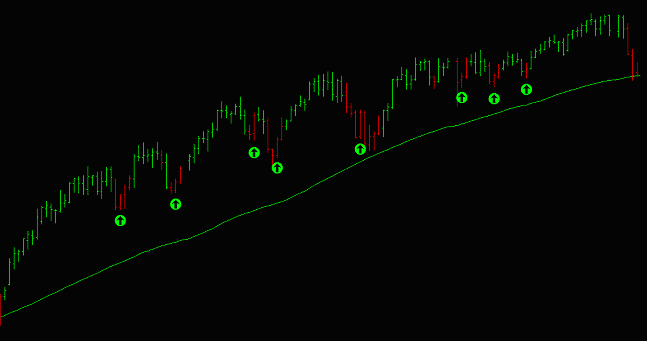
A better entry can often be achieved by buying a red bar at the first sign of bullish behaviour – typically an up-closing day. Examples of this type of long entry have been marked on the chart above with green arrows.
Here are a few other things you should consider:
- The precise entry signal can be changed. You could wait for the prior day’s high to be taken out on a stop, or you could stalk the market in a lower timeframe, perhaps employing the same technique above but on a ‘micro’ level. But the key concept here is to enter whilst the pullback is still underway (red bars), and not once the trend resumes.
- You should take care to understand how this type of entry modifies your risk profile. Typically, you will experience a greater frequency of premature entries and adverse excursions or stopped out trades, but your winning trades should be moderately larger than those achieved by awaiting a clear resumption of the uptrend (assuming the same exit methodology).
- Rather than a moving average, you might like to refer to the Anchor Trend with a moving average setting, or any other of the longer term trend indication techniques. Equally, you could apply your long term trend filter to a weekly or monthly chart rather than a daily one.
Of all the different methods of trend identification, some of the oldest involve nothing more than simple moving averages. Though the crossover of two moving averages is often referenced as an entry signal, where pure trend determination is concerned we have found that the directional slope of a single SMA has proven to be the most profitable and robust measure. This simply means that price is considered to be in an uptrend when the average is higher than it was one bar before, and in a downtrend when the average is lower than it was one bar before. Sometimes the simplest things are the best!
Entering ‘True’ in the Delphic Anchor Trend’s ‘MovingAverage_On’ input will switch this function on. Bars will be colored green to indicate an uptrend when the average slopes upward, and in a downtrend when the average slopes downward. The length of the moving average can be adjusted by changing the indicator’s ‘Length’ setting.
Simple Moving Average Filters and Range Bars
With the strategy that follows we’ll take a look at the TradeStation Anchor Trend’s ability to determine trend within the same timeframe that our entry signals will be generated from, rather than a higher reference timeframe. We’ll also explore the benefits of using Range Bars within our strategy, as well as another Delphic indicator – the Key Levels tool – to derive our profit targets.
| Range bars were conceived by Brazilian trader and broker Vincent Nicolellis in 1995. They are not time dependent, and are designed to display data with minimal noise, focusing and clarifying price movement in volatile markets.
Sometimes called ‘momentum bars’, constant range bars consist of a high, low, open, and close. The high-low range of each bar, however, is constant. A new bar is only able to form once price exceeds the fixed range of the current bar. All bars therefore close at either their high or low, and it is possible to state with certainty the possible range of the close of the next bar. |
Our method will be to buy an oversold market in a long term uptrend, exiting the position for a profit at the last swing high. We’ll identify an oversold market as one that causes a 3-period RSI to close below 25. Our stop-loss will be placed at a distance equal to one range bar from our entry point (i.e. 100,000 * 0.015 = $1500 stop-loss).
Here are the entry conditions for short positions:
- The 38 period Delphic Moving Average Trend is Down (bars are painted red).
- 3 Period RSI closes above 75.
- A stop loss is placed at a distance equal to one range bar above the entry.
- A profit target is placed at the last swing low, (defined here using the Delphic Key Levels indicator).
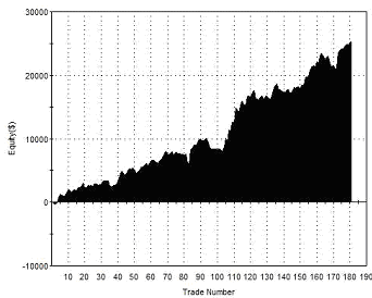
The chart below shows the results of trading this strategy in the EUR/USD currency pair over a ten year period:
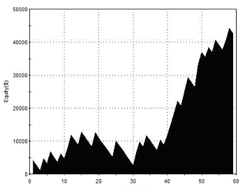 |
Total Net Profit Profit Factor Long Profit Factor Short Profit Factor Total Trades Percent Profitable Avg Trade Net Profit Maximum Drawdown |
$42,663 1.84 1.93 1.73 59 42.37% $723.10 $11,793 |
| Performance Report – SMA Filter & 0.015 Range Bars – EURUSD – 29/10/2002-21/09/2011 | ||
 Both our stop-loss and our profit target are derived without any optimization, the one being dependent on the range bar size, and the other on prior market behavior.
The length of the moving average above – 38 periods, however, has been optimized. The chart on the right shows the results for other SMA lengths ranging from 2 to 70.
It is clear that the results achieved with a 38 period SMA are somewhat outlying, and probably not realistic of what could be expected in real trading with this strategy. There is a disappointing inconsistency to the results viewed across all parameter inputs, and this suggests a possible lack of robustness for this system.
Furthermore, the drawdown isn’t really satisfactory considering the net profit. Look at it this way: if you were trading with a $20k account, you would have to endure a drawdown of more than 50% of your starting equity in order to achieve a 21% average yearly return, and even this assumes that you were able to select the most optimal parameter without the benefit of hindsight.
However, the strategy did prove profitable across a fairly broad range of parameters, and so could form the basis for further development or testing.
Alexander Elder’s Triple Screen Method
First presented in a 1986 issue of Futures Magazine, Alexander Elder’s Triple Screen method combines a trend-following approach with counter-trend techniques, and makes use of multiple timeframes in its analysis.
Though we have found other indicators to be more effective than those that Elder recommends (Force Index, Elder Ray, MACD), the general concept that underlies this approach is one that we have found to be highly reliable across many markets and timeframes.
The triple screen method uses the highest timeframe to identify the long term trend, a second timeframe to identify overbought/oversold areas, and the lowest timeframe to derive a momentum-based entry using a trailing stop order.
Combining Price Patterns with the Anchor Trend
In this section we’ll take a look at how three ‘price patterns’ can be combined with different Delphic Anchor Trend functions to filter the signals these patterns generate and provide profitable trading methods. At the end, we’ll pitch all three patterns and filters together to see how they would have performed as a single market system trading multiple signals.
2-Bar Acceleration Pattern and the DMI Trend
The first pattern we will examine is a ‘Two-Bar Acceleration’. These counter-trend patterns have proven reliable in indices such as the S&P500, the Russell, or the Nasdaq; it would not be advisable to employ them in markets that are more prone to strong trending moves.
In its simplest sense, this pattern comprises of two consecutive bars that close higher/lower than the previous bar. However, we also need to see acceleration in the move. We can define this by specifying that the second bar’s close must be higher/lower than the first bar’s close by an amount that is greater than at least half the range of the first bar. Here are some examples so that you can see what this looks like on a chart:
 |
 |
| VALID SIGNAL FOR SHORT ENTRY | PATTERN LACKING ACCELERATION |
The chart on the left shows a valid short signal because Bar 1 closes higher than the bar before it. Bar 2 then closes higher than Bar 1 by an amount that is greater than half Bar 1’s range.
Compare this with the chart on the right: although Bars A, B, and C all close lower than the previous bar, none of them close lower by an amount greater than half the prior bar’s range. To make the lack of downward acceleration clearer, a line has been added between the closes – can you see how this falls less steeply between bars A to C, indicating deceleration? No buy signal would be generated by the formation on the right.
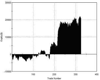
If we trade every long and short signal generated by this strategy in the E-Mini S&P futures contract, exiting on the first close, what would be the outcome? The results are shown below:
 |
Total Net Profit Profit Factor Long Profit Factor Short Profit Factor Total Trades Percent Profitable Avg Trade Net Profit Maximum Drawdown |
$34,655 1.46 1.60 1.31 496 49.55% $7.70 $8,807 |
| Performance Report – 2Bar Acceleration Pattern – @ES – Daily Bars – 30/04/2002 – 30/04/2012 | ||
All trades were held for one day from entry and no stop loss was used. This seems a reasonable start, and gives us a clear edge that we can build upon. It is notable that the success rate for this pattern is only around 50%, suggesting that profitable moves tend to be stronger than unprofitable ones – this is an encouraging sign that the underlying pattern has validity.
The profit factor is good, but this figure alone might inspire us with more confidence than the rather choppy equity curve shown to the left. Would you want to trade this curve? The next thing that we will test is to apply an Anchor Trend filter rule using the trend of the DMI, which will hopefully smooth the volatility of the equity and improve returns.
 ‘DMI’ stands for ‘Directional Movement Index’. The DMI trend signals the crossing of the DMI+ and the DMI- lines, which measure bullish and bearish trend strength. It is an averaging of these two calculations which forms the basis of the popular ADX strength indicator.
We’ll only take long signals when the DMI+ is greater than the DMI- and shorts when the DMI- is greater than the DMI+. We need to decide upon a length setting when we apply the DMI Trend.
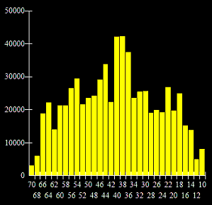
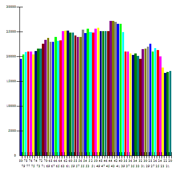
As we haven’t yet optimized any other variable within the strategy that we are building, we can do this with the length setting for the indicator – the results of optimizing this value from 20 to 80 periods are shown to the left.
From this optimization chart it is clear that any of the length settings tested would have been profitable historically. The optimal value of 43, however, appears to be a bit of a random outlier. A value of 50, on the other hand, lies within a broad range of similarly profitable values, suggesting that it is a robust choice. We’ll proceed with this length setting for the DMI.
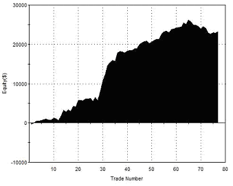
The results of trading the 2-Bar Acceleration Pattern with the DMI Trend filter are shown below:
 |
Total Net Profit Profit Factor Long Profit Factor Short Profit Factor Total Trades Percent Profitable Avg Trade Net Profit Maximum Drawdown |
$25,215 2.08 1.89 2.20 181 57.46% $139.31 $3,837 |
| Performance Report – 2Bar Acceleration with DMI Filter – @ES – Daily Bars – 30/04/2002 – 30/04/2012 | ||
The important parameter to look at here is not the net profit (which has fallen), but the profit factor and maximum drawdown. The profit factor is significantly improved. The drawdown, meanwhile, has been more than halved. This represents a significant improvement to the system – it suggests that we could have traded two contracts with the DMI filter rule and still suffered a less severe drawdown than that which was produced when trading without the filter rule. Trading two contracts would obviously also have doubled our net profits.
If you’re paying close attention then there is another aspect of the differences between these two reports that should have set alarm bells ringing: in the first report (no filter) there was a clear bias to performance for long entries, and in the second report (with the DMI Anchor Trend filter) there was a clear bias to performance for short entries.
What is this disparity telling us? One way to rationalize it would be to conclude that buyers will step in after two accelerating down closes in all markets, whereas sellers will only step in after two accelerating up closes in clearly down-trending markets. Stock indices are never symmetrical in the way that other instruments can be – there is a clear difference in behavior between buyers and sellers. In the statement above, for example, it may not be the case that sellers will only enter following two up closes in a down-trending market, but rather that buyers lose interest after two up closes precisely because the market is trending down.
One way to address this situation would be to employ the filter rule only for short entries. What the chart below shows, however, is the result of optimizing the length of the DMI Anchor Trend used for long entries separately from short entries:
| Optimal DMI Length | Long Trades (44) |
Short Trades (42) |
| Total Net Profit | $7,925.00 | $18,777.50 |
| Gross Profit | $16,800.00 | $33,190.00 |
| Gross Loss | ($8,875.00) | ($14,412.50) |
| Profit Factor | 1.89 | 2.30 |
There is no significant change here, suggesting that historically this pattern has simply been more effective on the short side. Whatever the case, we won’t be pursuing this line of modification as we develop our system, but will instead revert back to a standard look-back value of 50 periods.
What else could be done to improve our strategy?
If we stick with our entry pattern and filter rule then the next thing we can turn our attention to is the exit rule (remember that this is currently just a time-based exit at the daily close following entry). Are we leaving profits on the table? Look back to the very first chart example of the pattern that we examined above. You can see that the day following entry provided us with just a very small profit, even though the market then moved significantly in our favor. The following results show what happens if we exit positions at the close of the second day after entry:
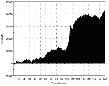 |
Total Net Profit Profit Factor Long Profit Factor Short Profit Factor Total Trades Percent Profitable Avg Trade Net Profit Maximum Drawdown |
$42,350 2.14 1.84 2.29 170 52.29% $249.12 $6,050 |
| Performance Report – 2Bar Acceleration with 2 Day Exit – @ES – Daily Bars – 30/04/2002 – 30/04/2012 | ||
This clearly produces a greater net profit, but it also seems to put us back in the situation we had before we added our filter rule: significant draw-downs, plateau periods in the equity curve, and greater volatility of returns. We could of course introduce a profit target, but that would also prevent us from capturing the occasional massive profits that can be taken when there is a runaway day in favor of our position.
So let’s try something a little more sophisticated: we’ll exit at the close one day after entry only if an acceptable profit has been achieved or if the position is negative, and otherwise we will hold for a second day. We’ll define an acceptable profit as a move of half the range from entry.
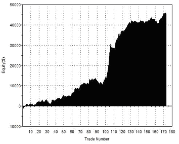 |
Total Net Profit Profit Factor Long Profit Factor Short Profit Factor Total Trades Percent Profitable Avg Trade Net Profit Maximum Drawdown |
$45,400 2.35 2.07 2.47 173 58.38% $262.43 $5,112 |
| Performance Report – 2Bar Acceleration Variable Exit – @ES – Daily Bars – 30/04/2002 – 30/04/2012 | ||
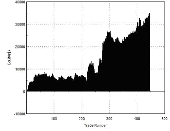
These results are interesting. We have significantly improved the net profit without significantly impacting upon any other performance metric, although the drawdown has been slightly increased. The equity curve appears less smooth, but notice that the more severely sloping area points clearly upwards, as the new entry rule allowed profits to run with the increased volatility of the 2008-2009 period.
Here is the TradeStation EasyLanguage code based on the rules we have developed:
| // TradeStation 9.0 EasyLanguage Strategy Code // 2-Bar Acceleration Pattern with DMI Filter for ES Daily BarsInputs:Length(50);If DMIPlus(length)>DMIMinus(length) and c<c[1]-0.5*range[1] and c[1]<c[2] then Buy this bar;If DMIMinus(length)>DMIPlus(length) and c>c[1]+0.5*range[1] and c[1]>c[2] then Sellshort this bar;If Barssinceentry=1 and c>entryprice+(range*0.5) then Setexitonclose;If Barssinceentry=2 then Setexitonclose; |
Cup and Cap Patterns and the Squeeze Momentum Trend
The next pattern we will examine is one that most traders will be familiar with, though it has been given countless names. The picturesque name of ‘Cups and Caps’ used by Art Collins in his excellent system development book ‘Beating the Financial Futures Market’ is how we will refer to it here.
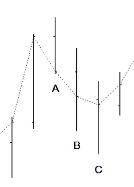
A ‘Cap’ forms when price makes a higher high than the prior bar, and then the subsequent bar makes a lower high. It is the basis of the ‘swing’ concept that you have probably encountered before. A ‘Cup’ is simply the reverse of this: a low with higher lows on either side of it. The two diagrams below illustrate the Cup & Cap pattern.
 |
 |
| CAP FORMATION | CUP FORMATION |
Typically, a ‘Cup’ is considered a bullish pattern, and a ‘Cap’ is considered bearish, but when trading markets that are heavily mean reverting such as the indices, we have found that it is better to fade these conventional interpretations.
Here’s what happens if we buy following a ‘Cap’ and sell short following a ‘Cup’, exiting our position at the first close following entry:
 |
Total Net Profit Profit Factor Long Profit Factor Short Profit Factor Total Trades Percent Profitable Avg Trade Net Profit Maximum Drawdown |
$20,862 1.30 1.21 1.38 325 49.54% $64.19 $5,925 |
| Performance Report – Cup & Cap Pattern – @ES – Daily Bars – 30/04/2002 – 30/04/2012 | ||
The edge here is questionable. Although the test period ends with a net profit, the profit per trade is small, the profit factor is not encouraging, and the equity curve is choppy and benefits mostly from a few good trades in the very volatile markets of 2008. Nevertheless, the pattern logic is very simple, so we should be able to add further rules without too much risk of curve fitting.
We’ll use the Anchor Trend’s Squeeze Momentum function to provide a long term trend filter. This algorithm does not adapt well to longer look-back periods, so instead of adjusting the length setting we’ll apply it to a weekly chart with the recommended default 20-period setting.
The second thing we can do is to introduce a fast moving average into our calculation. We are working on the assumption that the market is mean-reverting, so if we wish to establish, say, a short position, then we would want the market to be trading above it’s short term average in the expectation that it will revert back to this average price.
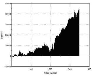
Adding in the weekly timeframe Squeeze Momentum filter and the Moving Average rule, with the average length optimized to 3 periods, produces the following results:
 |
Total Net Profit Profit Factor Long Profit Factor Short Profit Factor Total Trades Percent Profitable Avg Trade Net Profit Maximum Drawdown |
$23,237 3.22 3.17 3.25 77 61.04% $301.79 $4,637 |
| Performance Report – Cup & Cap with Filter Rules – @ES – Daily Bars – 30/04/2002 – 30/04/2012 | ||
Although the net profit here is not much better than before, it should be obvious from the profit factor that the introduction of the unoptimized Anchor Trend filter has resulted in a much more dependable strategy.
Breakout/Pullback Pattern and the Simple Moving Average Trend
To identify our third pattern we must first wait for the market to make a show of strength, breaking out to new short term highs. We then buy any retracement from this initial move to the lows of the breakout day. When the market makes new lows we do the opposite, selling short into any upward move. For both entries we will use limit orders and our holding period will be one day.
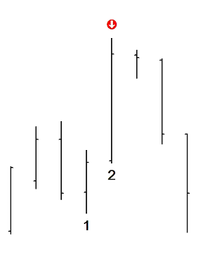
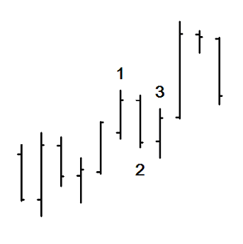 The chart on the right shows an example of this pattern.
At the bar marked 1 the market makes a new five-day high. The requirement for this rule has been optimized for the E-Mini S&P500 futures contract, but could be adjusted for any other market that you wish to trade.
At the bar marked 2 the market retraces to the lows of bar 1. This is where our buy limit order would be filled.The market rallies from the lows of bar 1, and we exit for a profit on the close of the following day, at the bar marked 3.
In this particular instance we could have netted a greater profit by holding for another day. In general, however, our testing has shown that this pattern is most profitable exiting after one day.
Now let’s see what happens when we trade every single instance of this basic pattern in the E-mini S&P500 futures (once again using a single contract and with no deductions for slippage or commission):
 |
Total Net Profit Profit Factor Long Profit Factor Short Profit Factor Total Trades Percent Profitable Avg Trade Net Profit Maximum Drawdown |
$37,125 1.24 1.53 1.00 508 52.95% $73.08 $15,387 |
| Performance Report – Breakout/Pullback Pattern – @ES – Daily Bars – 30/04/2002 – 30/04/2012 | ||
The results above appear fairly reasonable in terms of net profit, but it is clear that the entire profit is derived from long positions alone, with short positions just breaking even. At this stage we can either call this a ‘long-only’ strategy, or we can see whether the introduction of trend filters will improve the edge for short positions. We’ll do the latter.
For this pattern we will use the Moving Average function of the TradeStation Anchor Trend. As with previous patterns, this element of our strategy will be optimized.
 |
Total Net Profit Profit Factor Long Profit Factor Short Profit Factor Total Trades Percent Profitable Avg Trade Net Profit Maximum Drawdown |
$42,625 1.49 1.92 1.18 348 56.61% $128.23 $11,775 |
| Performance Report – Breakout/Pullback Pattern – @ES – Daily Bars – 30/04/2002 – 30/04/2012 | ||
We have improved several important elements of the system’s performance with this addition, including the overall net profit. The strategy now shows a modest edge for shorts when entering with the long term trend. Clearly the pattern can be profitable when traded in appropriate market conditions.
In the indices markets tend to fall much faster than they rise, as buy-and-hold investors exit long positions, active short sellers become engaged, and buyers step back and cease to support the market. As such, a plummeting market seldom has the opportunity to climb back up to the prior day’s high before the sell-off recommences – this is a state of affairs that arises from crowd behavior and we can reasonably expect it to be repeated into the future.
We can take advantage of this knowledge of index behavior with a modification to our order entry: for short entries, following a breakdown to new 5 day lows, we will enter short if the market manages to rally to within 40% of the prior day’s high. Let’s see where this final modification leaves us:
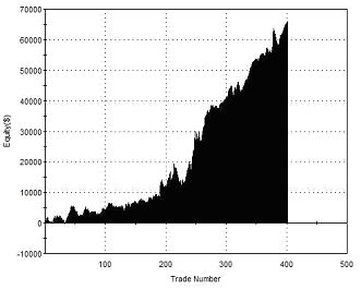 |
Total Net Profit Profit Factor Long Profit Factor Short Profit Factor Total Trades Percent Profitable Avg Trade Net Profit Maximum Drawdown |
$66,050 1.61 1.92 1.44 402 57.71% $164.30 $10,450 |
| Performance Report – Breakout/Pullback Pattern – @ES – Daily Bars – 30/04/2002 – 30/04/2012 | ||
Combining All Three Patterns into a Single Strategy
We have now reached the stage where we are ready to combine all three patterns and their respective Anchor Trend filters together into a single system. One thing that you may have noticed is that these patterns are not mutually exclusive: sometimes a series of bars occurs that qualifies as two or even all three patterns.
This leaves us with two choices when multiple patterns signal simultaneously:
- We can either trade multiple contracts, entering and exiting each according to the specific signal rules for each individual pattern. This would cause us to hold a maximum of three contracts at any time. In theory then, this ought to cause each pattern to be traded independently and the results should be the same as the total of the three individual studies above.
- We can continue to trade a single contract. Because all three entry patterns share the same exit, this is relatively simple to do. When we limit our position to a single contract, a new position will be established whenever we are flat the market and receive an entry signal from any one of our three patterns.
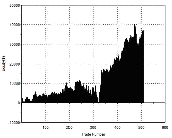
Shown below are the results of combining all three patterns and trading a single contract:
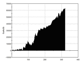 |
Total Net Profit Profit Factor Long Profit Factor Short Profit Factor Total Trades Percent Profitable Avg Trade Net Profit Maximum Drawdown |
$42,663 1.81 2.19 1.65 321 58.26% $196.85 $10,537 |
| Performance Report – Combined Pattern Strategy – @ES – Daily Bars – 30/04/2002 – 30/04/2012 | ||
A Smart Trick for System Developers . . .
A system like the one given above is really no more than multiple individually profitable strategies in combination. Rather like trading a portfolio of markets, trading multiple systems on a single market can aid diversification, so that when one approach enters a drawdown, its losses will be offset by the gains of the others.
If we consider this carefully, it becomes obvious that to be well diversified across a number of strategies we cannot afford to have long periods when we are only able to take signals to go long, but never short, or visa-versa. To do so would mean that we would not be well diversified against the possibility that our trend identification method could fail us (as all methods will do from time to time). We are somewhat protected against this possibility with the system that we designed because we used a series of different trend identification methods, such that the filters for each strategy may not be in full agreement at any given time.
Unfortunately, if we were to consider implementing this system in live trading, it would be sensible to remove these individual filtering methods and replace them with one single trend identification method, applying it to signals of all three strategies. This would reduce the possibility of curve-fitting and simplify the system’s rules. But it would also remove the benefits described above. How can we get around this?
One answer is to introduce a strategy that is not trend-dependent for its entries. When the other strategies can only accept short signals, this additional strategy would still be able to enter the market long, smoothing the equity curve should the market suddenly behave differently to what our trend filters suggest.
Anchor Trend
|