The Delphic TradeStation Key Levels indicator is an essential multi-purpose tool for traders in all timeframes. It can be used as a trend indicator, a breakout strategy, a system for stop-loss placement, and as an automated way to calculate horizontal support and resistance levels.
The indicator’s algorithms identify key levels at which the market has made significant reversals. These are plotted as horizontal lines on the chart, remaining in place until a new key level is formed.
Reversals and Breakouts
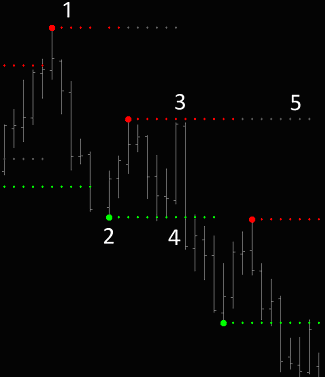 1. When price reverses after making a significant new high, this key level is then plotted above the subsequent price action as a red line for reference.
2. When price reverses after making a significant new low, this key level is plotted below subsequent price action as a green line.
3. These key levels can be expected to act as substantial support and resistance zones. When price returns to key levels it will often reverse.
4. When price reaches a key level and then decisively penetrates it, this constitutes a breakout, and a trend continuation can be expected.
5. Turning on the ‘Meta-Level’ function will cause the most significant key levels, those at which long-term market tops and bottoms were formed, to continue to be plotted on the chart as grey extension lines.
Swing Charting Applications
The Delphic TradeStation Key Levels indicator offers a great way to analyse trends using classical Gann/Swing charting principles.
In fast-moving markets the indicator efficiently picks out the key levels that you need to be aware of to rationalise the chaos, eliminate market ‘noise,’ and expose the underlying structure of price action. Read on for a crash course in swing charting . . .
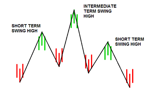
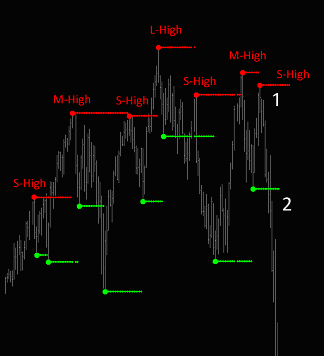
A Short-Term High can be identified when we see a high with lower highs on either side of it. On bar two price moves to a higher level than the high of bar one, and then on the third bar it is unable to move back to this high and moves lower instead.
A Short-Term Low is the opposite, and can be identified when we see a low with higher lows on either side of it.
 |
 |
| 3 Bar Swing High | 3 Bar Swing Low |
These price movements between short-term highs and short-term lows are referred to as SWINGS. Almost as soon as we begin to identify a few of these on a price chart it rapidly becomes apparent that price swings back and forth between short term highs and short term lows in an ongoing series of price movements. This gives us a mechanical method of identifying and measuring these movements.
The next step is to classify these highs and lows in relation to one another.
A Medium-Term High is defined as any short-term high with lower short-term highs on either side of it.
 |
| Medium-Term Swing High |
A Medium-Term Low is any short-term low with higher lows on either side of it. A LONG-TERM HIGH can be identified as any swing high with lower medium-term highs on either side of it, while a LONG-TERM LOW will be any low swing with higher medium-term lows on either side of it. This sequence is shown below:
 |
| Long-Term Swing High |
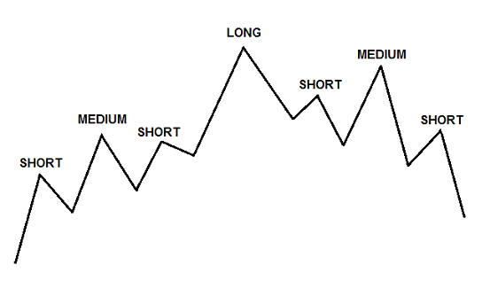
By connecting all the short term, intermediate term, or long term highs and lows, we can see how price has moved over the short, medium, and longer terms. These principles are valid in all time-frames and for all markets.
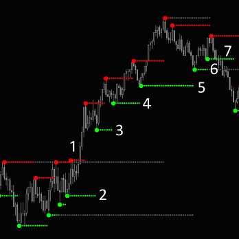
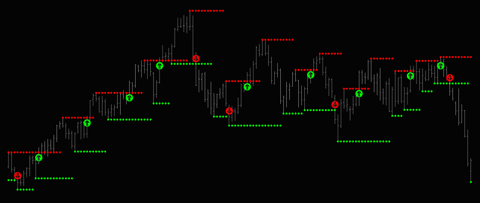
The Delphic TradeStation Key Levels indicator applies a more stringent set of conditions to identify price swings than the one described above, but can confidently be used in exactly the same way. Take a look at the chart below for an example of this:
•  Here, we can see how swing charting methods clearly define the steps leading up to a dramatic sell-off in the S&P500 index.
• The Delphic Key Level indicator has been added, and the levels are labelled as short, medium, and long term swings.
• At the point marked 1 on the chart a final short-term high completes the pattern to confirm that a long-term high, with lower medium-term high on each side, is now in place. This is traditionally referred to as a ‘head and shoulders’ pattern.
• The break of a prior short term low at point 2 would provide an optimal short entry point on the daily chart for swing traders.
• For day-traders, it provides a clear signal that the long term trend is now downwards, and that the focus should be on short positions.
Pro-Trader Tips
“The concept of the ice line is that once the market moves through the boundary of a pattern, that boundary line should ideally separate all the price action that preceded the breakout from the price behaviour following the breakout. To be a valid breakout, I want to see a market penetrate the most recent high or low price that defined the boundary” Peter L Brandt
Key Levels are particularly effective reference points on longer timeframe charts, where they will be seen by the majority of market participants. When the nearest key level support is too far away on the chart you’re trading from, rather than pass on the trade, use a lower timeframe chart to locate a key level that offers a better risk to reward ratio.
“No matter what you have heard, a market is never too high to buy or sell. When the market gives you the opportunity of a fourth test of support or resistance, this is usually a gift trade.” Neil Weintraub
Trailing Stop Strategy
Because the Delphic Key Levels can be expected to act as significant support and resistance, they can provide a very logical place to locate stop-losses. As a position moves in your favour, the stop can be trailed to successively higher key levels to lock in profits.
On the right, on the fourth attempt price breaks through the key level at point 1 with increased volume. If you took a long position at the breakout your stop could be placed at the level marked 2, and then trailed up to successively higher key levels until you were stopped out for a profit at point 7.
On the daily charts, this type of trailing stop strategy is typical of how many of the large trend-following funds operate. Notice also how the tiers of key level support form closer together as the trend loses momentum and the market struggles to make higher highs.
Profit Target Strategy
To take advantage of this strategy you will need to turn on the indicator’s built in ‘Meta-Levels’ feature on the inputs tab. This will cause the most significant key levels – those at which long-term market tops and bottoms were formed – to continue to be plotted on the chart as grey extension lines.
You can determine how significant a swing you wish for the meta levels to identify by adjusting the ‘Stength’ settings on the inputs tab (you can also adjust these for the standard key levels, but we have set these to what we have found to be the most useful default setting).
In the same way that you would place a stop-loss just beyond the key levels, you should place profit targets just before them – many traders will be watching these levels and may ‘front-run’, causing price to reverse several ticks before the key level is actually reached.
On the chart below, the Delphic Squeeze indicator has signalled a short entry at point 1. A sensible short entry would be when price penetrates below the key level at point 2 (see ‘Breakout Entries’ above). A logical stop placement would be just above the key level market at point 3 (See ‘Trailing Stop Strategy’ above).
Just above the long term low shown by the grey extension line at point 4 is an ideal profit target. Because the initial risk is from point 2 to 3, and the reward is from point 2 to 4, the trade would provide an excellent reward to risk ratio of around 3:1.
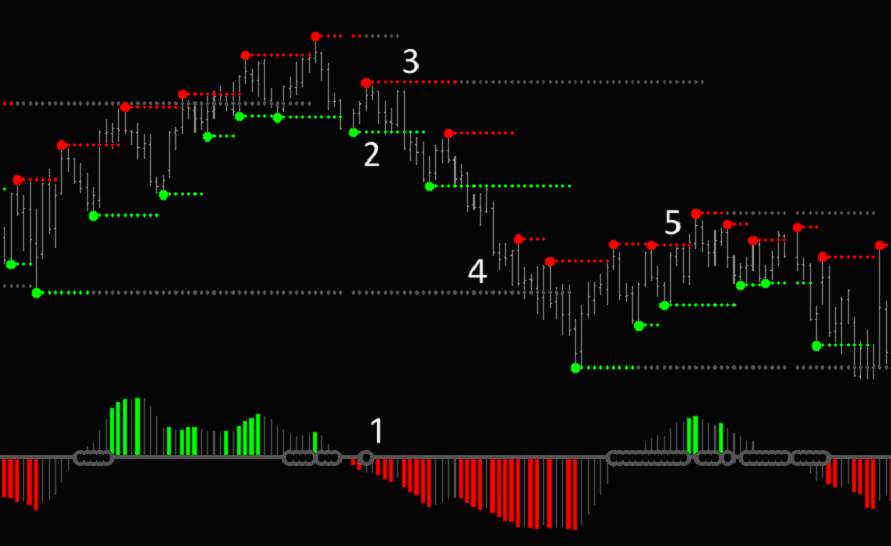 At the point marked 5 you can see that there is a failed long entry signalled by the Squeeze indicator. Though the market quickly reverses in this instance, the overhead key level shown by the grey extension line at point 3 would have provided an ideal profit target.
Momentum Patterns
Many patterns can be picked out with the Key Levels indicator, one being a loss of momentum. Because a key level continues to plot until a new key level is identified, the length of time for which a level plots can provide a simple visual indication of a market’s momentum. As momentum is lost, trending moves become less sustained and retracements occur more often, causing key levels to be plotted with greater frequency.
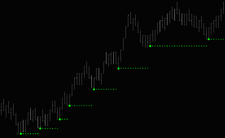
Conversely, the chart below shows accelerating upward momentum. As the market moves upwards the distance between each successive swing low is increased.
Key Levels – A Breakout Strategy
It’s fairly well known that breakout strategies, such as those used by the ‘Turtles’ in the 70s and 80s, are not quite as effective as they used to be. Successful modern day trend following funds (which now account for the majority of systematic managed futures funds and commodity pools) depend upon their ability to trade vast, diversified portfolios of instruments on exchanges around the world in order to beat benchmarks and generate low volatility returns.
Most independent traders (and even smaller funds and family offices) lack the capital and means to trade such a broad range of markets around the clock. Trading breakouts of support and resistance in certain markets can, however, still be a very lucrative approach – the crucial requirement is to establish which instruments exhibit trending behaviours and are best to trade.
Some markets are capable of producing sustained breakout price movements. These can be divided into two approximate types: those that spend most of their time in narrow ranges but occasionally undergo strong trending periods, and those that are almost permanently active, displaying constant directional volatility. Many markets that are affected by seasonal influences and marked changes in supply and demand, such as commodities, fall into the former category (take a look at a chart of Cotton or Orange Juice futures, for example). Our strategy, however, will focus on markets that exhibit recurrent trending behaviour.
To get an idea of which markets might be receptive to a breakout strategy, we can undertake a data-mining exercise.
This is often the best way to begin researching a market that you wish to trade – by exposing very general, underlying tendencies in the market’s behaviour a trader can then make an informed decision about the best approach to take, in order to extract profits from it. To test the capacity for significant price change in each market, we calculated the percentage of each weekly bar that occurred outside the range of the previous bar.
If you recall, we acknowledged that some markets undergo significant trends, but on a very intermittent basis. To distinguish such markets from those we wish to target – markets that show a consistent proclivity for substantial price change, we calculated the standard deviation of monthly percentage price change.
We want to focus on those markets that spend the most time, on average, trending outside their prior ranges (as measured in the blue column), and with a low standard deviation (the red column) of this measure. We can consolidate this information by dividing the red column into the green column to give a ‘Trend Factor’ (as measured in the pink column). Markets that have a high ‘Trend Factor’ (calculated in the final column) should be those that exhibit a strong tendency to trend on a highly consistent basis.
| Instrument | Trend Measure | Std Dev Trend | Trend Factor |
| Australian Dollar | 41.2 | 26.73 | 1.54 |
| British Pound | 37.88 | 25.96 | 1.46 |
| Canadian Dollar | 38.99 | 25.82 | 1.55 |
| US Dollar Index | 40.59 | 26.17 | 1.55 |
| Euro Spot FX | 39.23 | 25.52 | 1.53 |
| Japanese Yen Spot FX | 36.49 | 26.74 | 1.36 |
| Swiss Franc | 38.94 | 25.43 | 1.53 |
| United States Oil ETF | 43.06 | 33.61 | 1.28 |
| E-Mini Nasdaq | 41.22 | 28.05 | 1.47 |
| Mini-Russell | 38.88 | 27.49 | 1.41 |
| E-Mini S&P500 | 39.28 | 25.76 | 1.52 |
| Diamonds ETF | 43.64 | 28.60 | 1.52 |
| Eurodollars | 37.53 | 28.07 | 1.34 |
| Feeder Cattle | 42.28 | 28.35 | 1.49 |
| Live Cattle | 40.76 | 25.54 | 1.59 |
| Lean Hogs | 42.69 | 27.56 | 1.55 |
| Pork Bellies | 70.86 | 51.67 | 1.37 |
| Exxon Mobil | 42.25 | 29.70 | 1.42 |
| Cocoa | 40.91 | 28.40 | 1.44 |
| Cotton | 44.71 | 29.47 | 1.52 |
| Coffee | 42.07 | 28.50 | 1.47 |
| JP Morgan Chase | 38.97 | 27.71 | 1.40 |
| Orange Juice | 41.10 | 28.43 | 1.44 |
| Sugar #11 | 41.85 | 27.53 | 1.52 |
| Amazon | 41.85 | 29.53 | 1.41 |
| Apple | 47.68 | 32.53 | 1.46 |
| Vanguard Bond ETF | 43.38 | 28.65 | 1.51 |
| Gold ETF | 48.10 | 33.05 | 1.45 |
| Nikkei Futures | 40.50 | 27.79 | 1.46 |
In the final column above, markets that display a high ‘Trend Factor’ have been highlighted in green, and it is these that we might consider for trend-following and breakout type strategies (those highlighted in red, meanwhile, are those displaying relatively lower levels of trending behaviour, and these markets might be considered suitable for a mean-reversion type approach).
There are lots of reasons why the measures used in the test above aren’t perfect, and shouldn’t be used in isolation, but they do provide us with a useful starting point for further research. Other things to investigate might include the frequency with which swings occur and the average excursion when a prior swing is broken.
Now let us consider a strategy in one of these markets. The following strategy enters a position on a break above or below an Delphic Key Level. The Key Levels provide a smarter method for identifying areas of potential breakouts than simply referencing the highest high of the last N days, or using some form of volatility envelope, as they naturally filter out all but the most significant and highly visible price levels. Because such price levels are watched by many participants, a potential benefit of this approach is greater liquidity in the areas where we wish to establish a position.
The chart below shows entries in the EUR/USD Spot FX pair.
One thing that should be obvious from this chart is that the Key Levels indicator is able to ensure that where a market is clearly trending, entries are only initiated in the direction of the trend. This scenario can be observed on the left of the chart, where the Euro trends upwards. Because no downward move ever breaks the key level at a prior swing low, no short signals are given.
 |
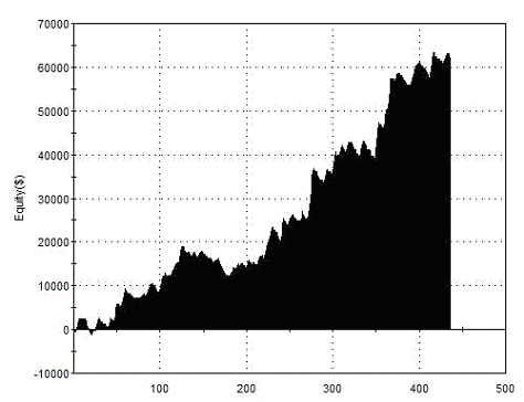
Total Net Profit Profit Factor Long Profit Factor Short Profit Factor Total Trades Percent Profitable Avg Trade Net Profit Maximum Drawdown |
$61,956 1.89 1.94 1.84 359 38.72% $172.58 $4,705 |
| Performance Report – Key Breakout – 1 Day Hold – Euro – Daily Bars – 15/02/2002 – 15/02/2012 | ||
Above are the results trading this strategy over a ten year period. A $500 stop-loss was used, and this was moved to break-even after a $500 favourable excursion. If not stopped out, all positions were exited on the close one day after entry. There was no limit on the number of attempts at entry permitted at any single Key Level – sometimes a profitable breakout would occur after numerous previous attempts at entry were stopped out – this is a key element of breakout trading, and is manifest in the relatively low percentage win rate in the report.
We won’t investigate the impact of this dollar stop-loss within the strategy in this article, nor the possibilities of trailing the stop to break-even (as the early trend-following ‘Turtles’ were known to do), but anyone wanting to trade in this way would be advised to do so.
“When I have been whipped around over a series of trades, every fibre of my being wants to bypass the next signal. When I have had a series of trades turn from a profit to a loss, I have an overwhelming urge to find any excuse for taking the first profit the markets offer up.” Peter L Brandt.
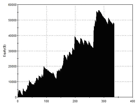
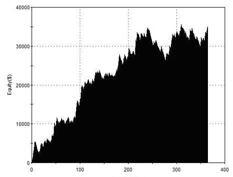
Strategies such as this often gain their edge from a small number of significant moves or ‘outliers’. Our one day exit is therefore possibly not ideal. The charts below shows the result of exiting on the close 1-25 days after entry (on the left is net profit, and on the right is profit factor). It is apparent that 23 is the historically optimal holding period for this strategy in the Euro over the test period. What is far more important to us, though, is that the strategy was profitable for all holding periods, suggesting that regardless of whether or not we were to have chosen the optimal holding period the strategy would still have turned a profit.
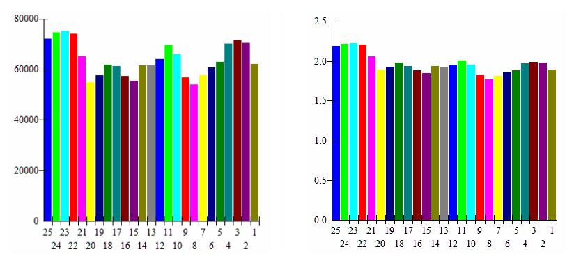 Total Net ProfitIt also suggests that we could scale out of positions after any of these holding periods, maintaining net profitability but with possible smoothing benefits for the equity curve. Here, one quarter of the position was exited after each of 5 days, 10 days, 15 days, and 20 days.
 |
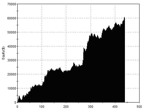
Total Net Profit Profit Factor Long Profit Factor Short Profit Factor Total Trades Percent Profitable Avg Trade Net Profit Maximum Drawdown |
$62,192 1.94 2.22 1.61 436 41.51% $142.64 $6,886 |
| Performance Report – Key Breakout – Scaled Exits – Daily Bars – 15/02/2002 – 15/02/2012 | ||
Now we’ll turn our attention to risk management. Rather than modify the stop-loss strategy, we’ll examine a technique for minimising the risk associated with longer holding periods. It is often remarked that day-traders can “sleep easy at night” because they always end the day flat. In modern markets that trade around the clock, this problem vanishes, as one can always leave a stop in the market to be activated at any time of day or night. Unfortunately this is not the case on weekends, when the markets close completely. The test below shows the result of flattening all positions on Friday’s close, and then re-establishing them on the subsequent open, once again using a one day holding period:
 |
Total Net Profit Profit Factor Long Profit Factor Short Profit Factor Total Trades Percent Profitable Avg Trade Net Profit Maximum Drawdown |
$60,072 1.67 1.78 1.55 440 39.09% $136.53 $6,844 |
| Performance Report – Key Breakout – Flat Weekends – Daily Bars – 15/02/2002 – 15/02/2012 |
||
It can be seen that this reduces overall profitability, and also increases the maximum drawdown. Going flat with long term positions each weekend has both advantages and disadvantages, and it must be left to each individual to decide whether to hold positions in closed markets based on their own appetite for risk and desire for net gain.
There are many pitfalls that await the unwary when testing strategies. One red flag in the tests we have carried out above concerns the way that the back-testing software treats daily data. No information is provided in daily data about the order in which price movements occurred throughout the day. To overcome this we need to require the software to look ‘inside’ the daily bars to see in what order price movements occurred throughout the day. It will then be possible to know whether stops or targets were hit first.
 |
Total Net Profit Profit Factor Long Profit Factor Short Profit Factor Total Trades Percent Profitable Avg Trade Net Profit Maximum Drawdown |
$47,684 1.61 1.82 1.37 336 19.64% $141.92 $14,742 |
| Performance Report – Key Breakout – 10 Day Hold – Euro – 15/02/2002 – 15/02/2012 | ||
The tests above and below show the results when we look inside the daily bars of the Euro with our Key Levels strategy, and should be a more accurate representation of what we might have achieved in real trading.
 |
Total Net Profit Profit Factor Long Profit Factor Short Profit Factor Total Trades Percent Profitable Avg Trade Net Profit Maximum Drawdown |
$34,958 1.44 1.37 1.50 364 37.64% $96.04 $9,081 |
| Performance Report (Intraday) – Key Breakout – 10 Day Hold – Euro – 15/02/2002 – 15/02/2012 | ||
One thing that is immediately apparent once we adopt this higher resolution approach to testing is that the strategy fairs better with longer holding periods. It is vital that complications such as this are recognised and resolved during the testing process; only then will results be robust enough to trade with any confidence going forward.
Reading the manuals for other Delphic indicators for TradeStation will give you an idea of where many of these testing pitfalls await, and how they can be avoided or their impact reduced.
“Like many aspects of trading, support and resistance is a loose construct rather than a hard and fast rule. Prices are not guaranteed to bounce off former highs and lows; they just tend to. Sometimes they act a bit before, sometimes a bit after, sometimes not at all.” Curtis M Faith
“Support and resistance organises the trading landscape into well marked levels that predict swings and breakouts. Price action at these all important boundaries depends on their unique characteristics and specific locations. Support or resistance may represent an absolute barrier that cannot be crossed or exhibit elasticity that can be stretched but not broken. Swing traders earn their livelihoods as they find and execute setups along support and resistance interfaces.” Alan S Farley.
Key Levels
|