One of the few true recurring cycles within markets is the transition from periods of low volatility to periods of increased volatility. Sideways ranging movements where there is little market interest either from buyers or sellers are typically followed by breakout trends with renewed activity, as new participants enter the market driving it up or down.
The Delphic Squeeze is designed to signal periods of relative low volatility, allowing the trader to prepare to take advantage of the ensuing breakout move.
The indicator compares two different measures of volatility; Standard Deviation and Average True Range. Average True Range is an average of the range that includes gaps within its calculation. Standard Deviation is a much more sensitive and directional measure of volatility.
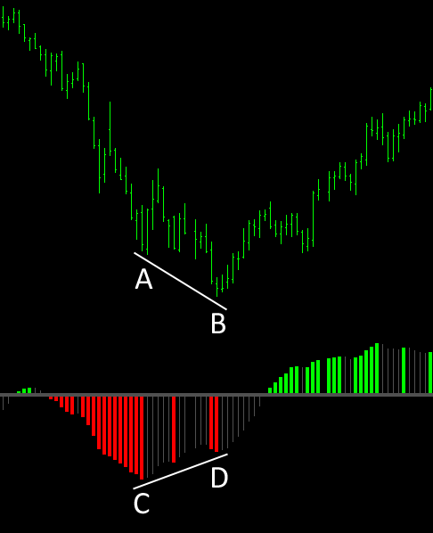
Take a look at the chart below:
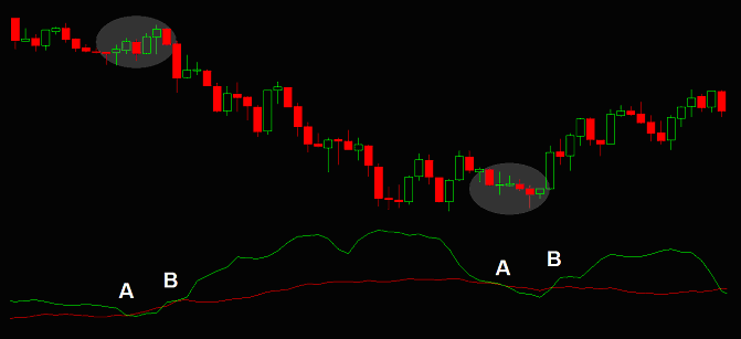
During the period above the Average True Range (red) remains fairly constant as the amount of movement within each period remains fairly constant (the bars are roughly the same size).
At the points marked A the directional volatility is also low, and the Standard Deviation (green) becomes less than the Average True Range. However, as price breaks out from the ranging pattern and begins to fall, the strong directional movement causes the Standard Deviation to increase sharply.
At the points marked B the Standard Deviation becomes greater than the Average True Range, and the volatility squeeze ends as a breakout movement occurs.
In addition to signalling periods of low volatility and consolidation, the Delphic Squeeze also incorporates a momentum oscillator to confirm market direction at the time of a breakout.
Here are some of the unique features that we think make the Delphic Squeeze a superior trading tool to other similar indicators that are available:
- Filter Trend Function – trade the path of least resistance by activating this function and filtering out squeeze signals that are counter to the long term trend.
- Volatility Measure – As an alternative to the widely used Standard Deviation calculation, the Delphic Squeeze also allows you to enable our own proprietary measure of volatility to generate signals. This enhancement uses the same volatility calculation from which the Intelligent Stop & Target indicator derives its power, and testing has indicated that this can provide superior performance.
Volatility Breakout
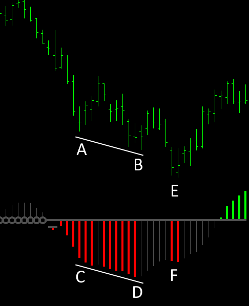
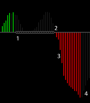 1. When price has entered a squeeze this is signalled by the grey markers that appear on the signal line.
2. Once the squeeze is over the line returns to normal, and more volatile market conditions will ensue.
3. The direction of potential breakout trends is indicated by the histogram, with green signalling a long entry and red a short entry.
4. One common exit strategy is close out a profitable position once the histogram loses momentum and turns grey.
Incorporating the Squeeze Indicator Into Your Trading
The Delphic Squeeze is a discretionary indicator and not a complete trading system. Trading every single squeeze signal using only the indicator is not likely to be profitable. Seek confirmation from price and volume for high probability trades.
Here are some tips on how to get the most out of the indicator:
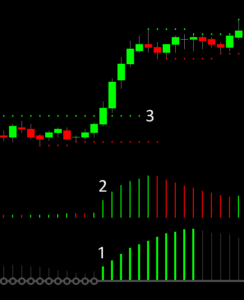 Once the squeeze ends, look for decisive penetration of a key support or resistance level. The Delphic Key Levels indicator can be used to identify these areas for order placement, as at point 3 on the chart on the right.
Good volatility breakouts typically involve significant volume increase as new participants enter the market.
Point 2 on the chart shows increased trading volume as price compression leads to price expansion and a trending move.
The point marked at 1 on the chart shows the end of a long pre-market squeeze. Powerful breakouts often occur around the open, at key reversal times, or as the market prices in new information following news or reports.
Volatility breakouts tend to endure when they occur in the direction of the longer term trend. Try using the Filter Trend function of the Delphic Squeeze indicator to identify these high probability moves.
Momentum Divergence
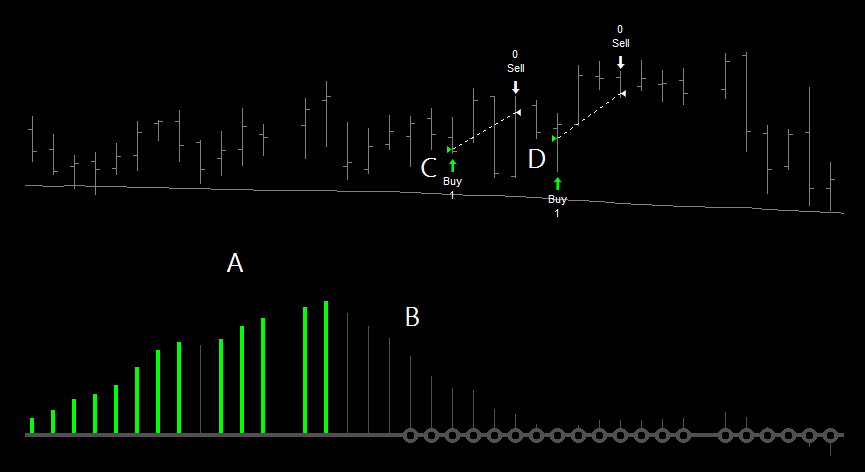
Divergence between price action and the Squeeze momentum is a powerful signal that a trend may be losing its strength.
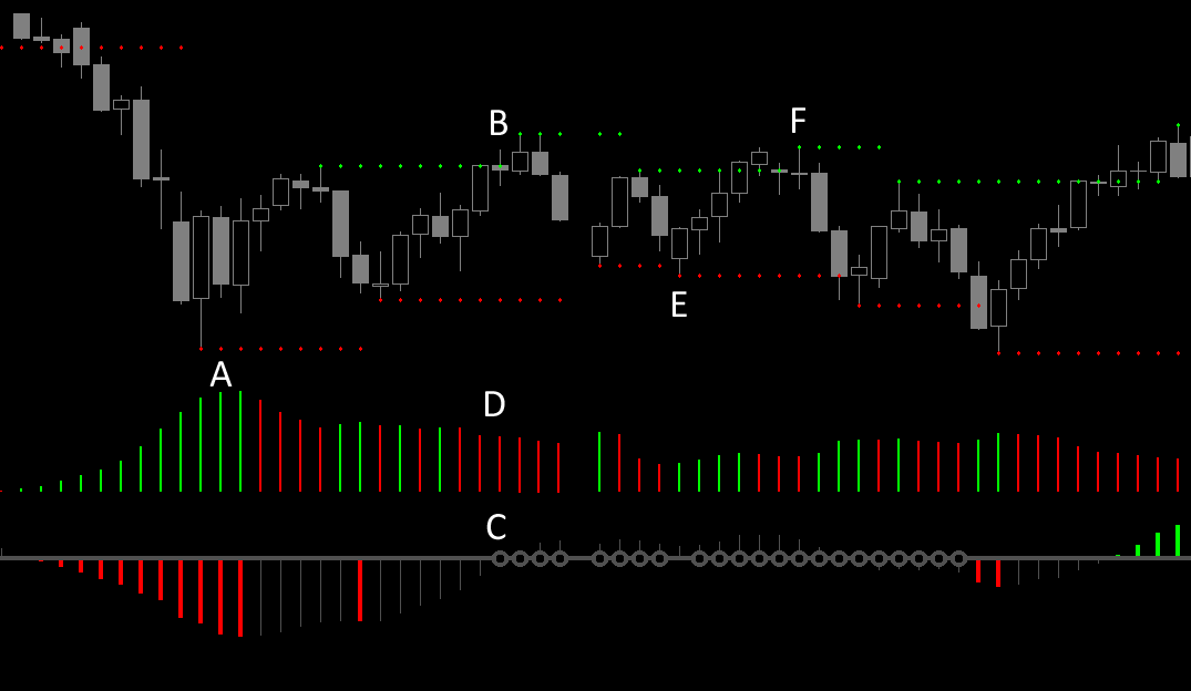
At points A and B above the market falls to new lows, but at the corresponding points C and D on the indicator the histogram fails to make new lows.
This signals that the downward trend is losing momentum, and in this example the market reverses sharply upwards.
A possible long entry would be when the first grey histogram bar appears after D. With a stop-loss placed just below the lows at B, and a profit target at prior highs, this would provide an excellent risk-to-reward trading opportunity.
Momentum Continuation
When the price action is confirmed by the trend on the oscillator, the move has sustained momentum and may further continue in the direction it is moving.
At points A and B the market falls to new lows following a squeeze, and the histogram makes new lows along with it at points C and D.
This signals that the downward trend remains intact.
A possible entry would be to short the pullback that occurs after B.
A clear signal for exiting the position with a profit would be provided by the divergence that occurs at points E and F (see ‘Momentum Divergence’ above).
Trading in Low Volatility Markets
The Delphic Squeeze indicator can be used to identify choppy, range-bound markets. Once price enters an extended squeeze, employ counter-trend strategies to harvest profits from sideways price action. This can work well for swing-traders using daily charts, with volume used to confirm signals.
After a hard sell-off exhausts itself with the volume spike at point A, the market begins to drift sideways.
At point B price moves through a resistance level, but from point C we can see that a squeeze is now underway. The average volume is also falling, as marked at point D.
Markets do not usually break through key support and resistance levels on diminishing volume and low volatility, and this market soon reverses and sells off.
This pattern repeats itself many times before the squeeze is over (such as at points E and F), with the market pushing limply through support and resistance, only to reverse in the opposite direction the next day.
Bollinger Bands could be employed to provide counter-trend entry points, or the Delphic Key Levels indicator could be used as shown above. Notice how the squeeze momentum oscillator remains flat with no coloured bars.
Although further reversals do occur, once the squeeze is over and both volume and volatility are on the rise, these become riskier trades.
Developing an Intra-Day Squeeze Strategy
Firstly, let’s start by trying to determine the best times to trade a volatility breakout strategy using the Delphic Squeeze indicator.
Common sense would suggest that the regular cash session is when volatile breakout movements normally occur. But then how many times have you switched on your computer to find that the S&Ps have already gapped up thirty points before the open, or watched extreme movements carry through the close and continue overnight?
 The report on the right shows the profitability of the strategy by the hour in which the trade was entered (times are GMT). All trading signals were taken from a fifteen minute chart of the E-Mini S&P500 futures contract, and a $400 stop and profit target was used.
There seem to be some clear patterns in the profitability displayed here:
- Positions entered before 12:00 are unlikely to be profitable, as are positions entered after 23:00.
- The most profitable time to enter the market with this strategy is between 14:00 and 15:00 – the hour that spans the cash session open.
- The poor profitability of entries in the hour after 16:00 may be an aberration, although this time does coincide with the ‘doldrums’ of the early afternoon.
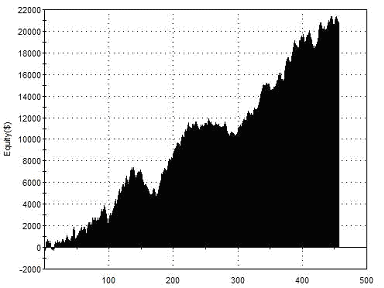
In all the tests that follow then, we’ll enter the market only between 12:00 and 23:00. Taking all such signals with the same parameters, the two year equity curve looks like this:
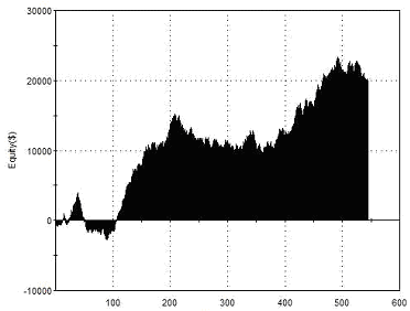 |
Total Net Profit Profit Factor Long Profit Factor Short Profit Factor Total Trades Percent Profitable Avg Trade Net Profit Maximum Drawdown |
$19,425 1.23 1.30 1.15 545 50.28% $35.64 $7,025 |
| Performance Report – Time of Day Entries – @ES 15 Minute Chart | ||
If you’re paying close attention to the figures above, some alarm bells should start ringing. The profit target and stop loss are identical but the percentage of trades that are profitable is only 50%, so how is the strategy making money?
The reason is that many trades are exited at a profit when a new squeeze begins, or are exited for a small loss for the same reason. This only occurs when the new squeeze signal is contrary to the direction of the open position, so profitable open positions remain unaffected.
Can the exit strategy be improved in any other way?
In the book ‘Mastering the Trade’, John Carter uses a two bar decline of the momentum histogram as a signal to exit a position. With the Delphic Squeeze such a decline is easy to recognise as the histogram bars will change (from red or green) to grey.
How does this exit signal fare in testing?
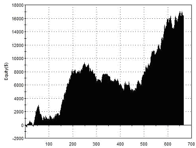 |
Total Net Profit Profit Factor Long Profit Factor Short Profit Factor Total Trades Percent Profitable Avg Trade Net Profit Maximum Drawdown |
$16,312 1.36 1.37 1.35 667 43.78% $24.46 $4,425 |
| Performance Report – Momentum Exits – @ES 15 Minute Chart | ||
This dynamic exit reduces overall profitability by a small amount, but also improves the profit factor (the single best basic measure of a strategy’s performance) and halves the drawdown.
Another refinement that we can explore is only entering when there is increasing momentum of the histogram (ie if a squeeze ends and the histogram is above zero but is grey, indicating declining momentum, the signal is not taken). This has a small but worthwhile impact upon overall profitability, average trade profit, and the profit factor.
We can take this a step further by saying that we will only enter new positions when there is increasing favourable momentum, but that we’re willing to exit a position on an opposing signal that doesn’t qualify for an opposing entry:
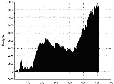 |
Total Net Profit Profit Factor Long Profit Factor Short Profit Factor Total Trades Percent Profitable Avg Trade Net Profit Maximum Drawdown |
$17,037.50 1.40 1.38 1.41 607 44.15% $28.07 $4,037 |
| Performance Report – Positive Momentum Entries – @ES 15 Minute Chart | ||
You’ve no doubt noticed that all the equity curves above contain a long ‘underwater’ period when the curve failed to make new highs. This period began at the start of September 2010 and ended at the start of June 2011. Is there any common feature of the market’s behaviour within this period that might have reduced the strategy’s effectiveness?
Examining a daily chart of the S&Ps we can see that the drawdown corresponded to a period in which the markets rallied smoothly, with few corrections and very low volatility. It is hardly surprising that a volatility breakout strategy would struggle to profit from a low volatility market such as this.
The report below shows the result of introducing a simple volatility filter to our Squeeze strategy – trades are taken only when the Average True Range is greater than its own 200-period simple moving average:
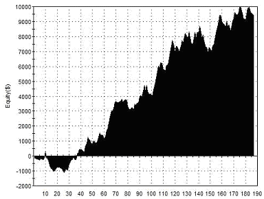 |
Total Net Profit Profit Factor Long Profit Factor Short Profit Factor Total Trades Percent Profitable Avg Trade Net Profit Maximum Drawdown |
$9,412.50 1.62 1.96 1.37 187 48.13% $50.33 $1,862.50 |
| Performance Report – Volatility Filter – @ES 15 Minute Chart | ||
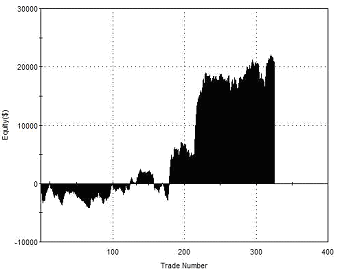
We now appear to have a Delphic Squeeze day-trading strategy that generates steady, consistent returns, but the final test is always to apply the strategy to new, unseen data. The last report covers our sample period above, and also the three years preceding it:
 |
Total Net Profit Profit Factor Long Profit Factor Short Profit Factor Total Trades Percent Profitable Avg Trade Net Profit Maximum Drawdown |
$20,775 1.47 1.57 1.39 59 42.37% $45.56 $2,987.50 |
| Performance Report – Out of Sample – @ES 15 Minute Chart | ||
The out-of sample performance here is encouraging. Another reason to be optimistic is that the market we have used for testing here – the e-mini S&P futures contract – is possibly the worst market we could choose for this strategy. The Squeeze indicator would benefit from a market more prone to volatile, breakout trending moves, such as the Euro.
“There is something about a dramatic and/or prolonged contraction of the Bollinger Bands and the subsequent explosion of activity that captures the attention. The bands are driven by volatility, and the Squeeze is a pure reflection of that volatility” John Bollinger
Using the Momentum Oscillator
The momentum oscillator component of the Delphic Squeeze can be a useful trend indicator in its own right. In fact, we also include the calculation that produces the Squeeze histogram as one option within the Delphic Anchor Trend. Let’s take a look at how this aspect of the Squeeze indicator can be used independently to provide entries for a swing trading strategy.
Below is a daily chart of the E-Mini Nasdaq future (@NQ). The Delphic Squeeze has been plotted beneath it, but for now we can ignore any volatility squeeze signals that are displayed along the central spine, and focus instead on the momentum histogram. A simple moving average has also been added.
The entry signal here is very simple: while ever the market is above its moving average, we wait for a momentum retracement of four consecutive bars to establish a long position. This four bar decline must not cause the momentum histogram to cross beneath its zero line.
The following points show this on the chart above:
A. The market is in an uptrend above the moving average, and the momentum bars are green.
B. Price retraces, causing the histogram bars to turn grey indicating a loss of momentum.
C. On the fourth consecutive grey histogram bar above the zero line we place a limit order to enter long at the day’s lows.
D. While ever the histogram remains above the zero line and the criteria for four consecutive bars is met, placing an entry order at the lows of the day remains valid.
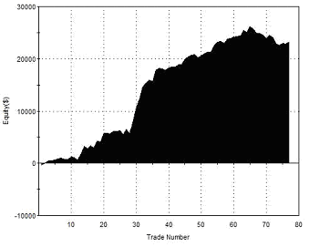
What follows are the results of trading the strategy across a number of markets, and a combined portfolio equity curve. A very simple rule with a time-based exit 3 days from entry was employed, but you could explore more sophisticated approaches to profit-taking. Position sizes are normalized, but no further money management overlay has been applied. The single contract returns shown below do not include any deductions for slippage or commissions, and the length of average used for the trend filter was 100 days.
| Symbol | Instrument | Profit Factor | Net Profit | Avg Trade |
| NQ | E-Mini Nasdaq 100 | 1.94 | 21,580 | 203.58 |
| ES | E-Mini S&P500 | 1.64 | 23,950 | 221.76 |
| YM | E-Mini Dow | 1.13 | 5,305 | 48.67 |
| E7 | E-Mini Euro | 1.46 | 15,600 | 150.00 |
| YG | Mini-Sized Gold | 1.38 | 8,883.60 | 84.61 |
| CL | Crude Oil | 1.40 | 35,290 | 367.60 |
| ED | Eurodollar | 1.15 | 7,362.50 | 61.35 |
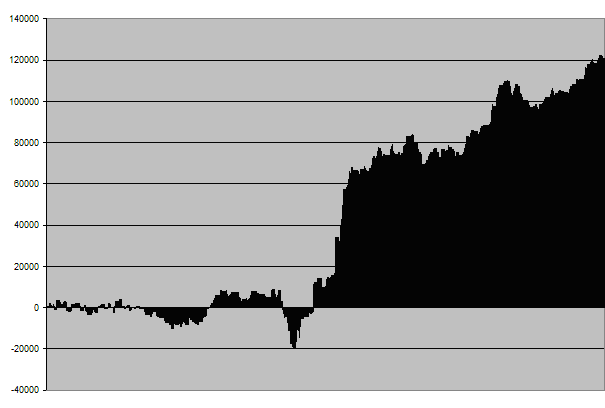
The returns displayed in the table above and the combined equity curve below are the result of trading a single contract in each of these markets over a ten year period. It’s important to note that this only provides a very basic way of comparing performance and in no way reflects what you’d expect in a real portfolio with position sizes adjusted for risk parity.
 |
||
| Squeeze Swing Trading Strategy – 10yr Single Contract Portfolio Returns | ||
While the equity curve above demonstrates strong positive returns with relatively low draw-downs, the long flat period with which trading commences is not attractive, and further research would be required to address this. Possible solutions include further expanding the portfolio, or applying more sophisticated money management techniques.
Here are some other more general suggestions for enhancing the returns from this strategy:
• Avoid buying markets that are overbought, or selling those that are oversold by only entering long positions below the upper Bollinger band, and short positions above the lower Bollinger band. This can help to ensure that the market still has plenty of room to expand in the direction of your trade.
• Use the volatility expansions from the DELPHIC Squeeze to find better trade entry locations intraday in the direction of the longer term swing trading signals.
Pattern-Based Signals and the Squeeze Momentum Trend
Here we’ll take a look at the potential to use the Delphic Squeeze momentum histogram as a filter for a pattern-based trading strategy.
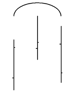
The term ‘Cups and Caps’ is used by Art Collins in his system development book ‘Beating the Financial Futures Market’ to refer to the chart formations we will use. A ‘Cap’ forms when price makes a higher high than the prior bar, and then the subsequent bar makes a lower high. It is the basis of the ‘swing’ concept that you have probably encountered before. A ‘Cup’ is simply the reverse of this: a low with higher lows on either side of it. The two diagrams below illustrate the Cup & Cap pattern.
 |
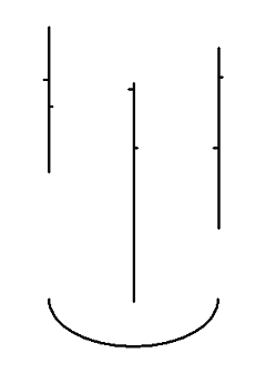 |
| CAP FORMATION | CUP FORMATION |
Typically, a ‘Cup’ is considered a bullish pattern, and a ‘Cap’ is considered bearish, but when trading markets that are heavily mean reverting such as the indices, we have found that it is better to fade these conventional interpretations.
Here’s what happens if we buy following a ‘Cap’ and sell short following a ‘Cup’, exiting our position at the first close following entry:
 |
Total Net Profit Profit Factor Long Profit Factor Short Profit Factor Total Trades Percent Profitable Avg Trade Net Profit Maximum Drawdown |
$20,862 1.30 1.21 1.28 325 49.54% $64.19 $5,925 |
| Performance Report – Cup & Cap Pattern – @ES – Daily Bars – 30/04/2002 – 30/04/2012 | ||
The edge here is questionable. Although the test period ends with a net profit, the profit per trade is small, the profit factor is not encouraging, and the equity curve is choppy and benefits mostly from a few good trades in the very volatile markets of 2008.
Nevertheless, the pattern logic is very simple, so we should be able to add further rules without too much risk of curve fitting.
We’ll now include the Delphic Anchor Trend’s Squeeze Momentum function to provide a long term trend filter. This algorithm does not adapt well to longer look-back periods, so instead of adjusting the length setting we’ll apply it to a weekly chart, with the recommended default 20-period setting.
The second thing we can do is to introduce a fast moving average into our calculation. We are working on the assumption that the market is mean-reverting, so if we wish to establish, say, a short position, then we would want the market to be trading above it’s short term average in the expectation that it will revert back to this average price.
Adding in the weekly timeframe Squeeze Momentum filter and the Moving Average rule, with the average length optimised to 3 periods, produces the following results:
 |
Total Net Profit Profit Factor Long Profit Factor Short Profit Factor Total Trades Percent Profitable Avg Trade Net Profit Maximum Drawdown |
$23,237 3.22 3.17 3.25 77 61.04% $301.79 $4,637 |
| Performance Report – Cup & Cap with Filter Rules – @ES – Daily Bars – 30/04/2002 – 30/04/2012 | ||
Although the net profit here is not much improved from what we before, it will be obvious from the profit factor that the introduction of the un-optimised Anchor Trend filter has resulted in a much more dependable strategy with smoother returns.
“In a narrow market, when prices are not getting anywhere to speak of but moving in a narrow range, there is no sense in trying to anticipate what the next big movement is going to be – up or down. The thing to do is watch the market, read the tape to determine the limits of the get-nowhere prices, and make up your mind that you will not take an interest until the price breaks through the limit in either direction.” Jesse Livermore
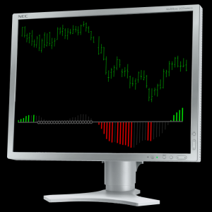
Squeeze Indicator
|