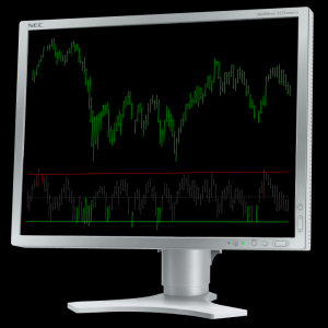
If you’ve had enough of buying market tops or exiting profitable trends at the first sign of trouble, then the Delphic TradeStation Value Charts could be the tool you need to revolutionise your trading. Value charts are a ‘normalised’ method of displaying price that enables you to see, at a glance, whether a market is trading at fair value.
A liquid market is the result of many participants engaging in an ongoing search for fair value across every time frame. Most trading occurs at levels of fair value, where there is widespread agreement between both buyers and sellers. Though fair value is constantly shifting as new information enters the market, excursions from recent fair values tend to be short lived; such excursions represent overbought or oversold markets.
 Properly using an Delphic’s TradeStation Value Charts in your trading can help you to:
- Avoid buying market tops or selling market bottoms.
- Buy markets when they have become oversold, or sell them when they have become overbought.
- Recognise short term corrections and hold profitable positions with confidence through minor retracements in strong trends.
- Identify pullback trading opportunities.
Unlike similar indicators on the market, the TradeStation Value charts comes packed with additional built in features to maximise the analysis applications of this powerful tool:
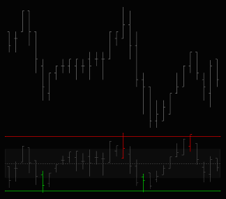
Divergence Identification. Entering any look-back period greater than zero will cause the indicator to search for periods in which there is divergence between price and the Value Chart. Bullish divergence periods are highlighted in green, and bearish divergences are shown in red. The indicator uses a proprietary divergence function that aims to closely duplicate the kind of signals that are usually identified by eye.
Value Chart Averages. Because Value Charts are just a normalised method of displaying price data, moving averages can be applied to them just as effectively. Setting the AverageOn to ‘true’ in the indicator’s ‘Inputs’ tab will cause an average of the closing price, to be plotted on the indicator pane (the length is the same as that used in the Value charts).
Clear Visual Highlights. For ease of use in fast-paced market environments, the indicator has been color coded to highlight user-defined overbought and oversold levels. Bar coloring is based on the high/low of the bar, not on the closing value of the bar. You can also adjust the upper and lower bands of the indicator as required.
Divergence Plays
Divergence occurs when price and an indicator move in opposite directions. If price makes a higher high, but the indicator makes a lower high, then there is divergence. It is typically the case that the indicator is the leading signal, suggesting that the price movement is to be questioned, and that a short position (or the exiting of any long position) should be considered. Divergence works exactly the same when a market falls to new lows and the indicator does not.
Divergences are powerful signals but have become somewhat overlooked (they’re probably neglected because many of the oscillators with which they are identified have become a little unfashionable).
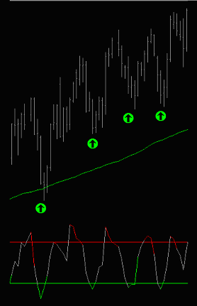
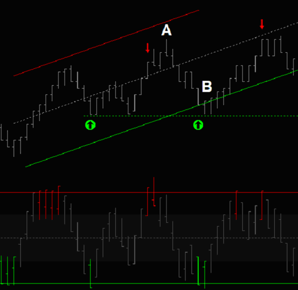
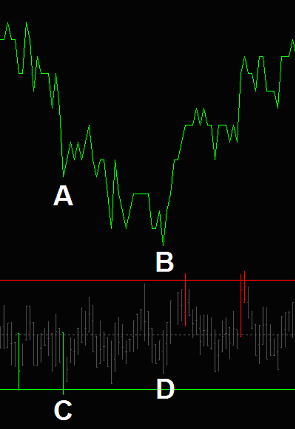 The chart on the right shows a clear example of bullish divergence. Price makes a low at point A, and then falls to a lower low at point B. Point C is the corresponding first low on the value charts, but then the indicator fails to make a new low at point D.
Divergence signals are always best identified by the well-practiced eye, and no mechanical method will ever capture this. However the Delphic Value Charts do come equipped with a smart inbuilt function to help flag divergences. What’s more, because this is function is mechanical we can see exactly how it would have performed with historical market data.
An example 5min chart of the Euro is shown below. The ‘Divergence Length’ input on the Delphic Value charts was set to 5. Bullish and bearish Value charts divergences signal a loss of momentum at both the high and the low of the day.
“Looking for divergences is one of the best overall ways to trade
when using an oscillator. Divergences are not easily programmed in computerised trading systems, and so a trader who uses them must trade with discretion.” Marcel Link
Signal Filtering with the Delphic Value Charts for TradeStation
In this section we’ll examine a profitable swing trading system which makes use of one of the standard TradeStation indicators – the Commodity Channel Index, or ‘CCI’ – and then see how the Value Charts can be used as a filter for the signals to improve aspects of the system’s performance.
Sometimes it pays to combine analysis methods in sophisticated and inventive ways, but sometimes just using two indicators that are designed for a similar purpose to confirm signals from one another can be a smart choice. This is the basis of what we will test below. First, let’s take a look at entry criteria of the basic CCI system:
 On a daily chart the Commodity Channel Index is added. This is an ‘unbounded’ oscillator, meaning that theoretically there is no upper or lower limit to the readings it can generate. In practice, however, levels above 100 are considered overbought, and levels below -100 oversold.
A 200 period simple moving average is added to the chart to act as a trend filter. Long entries will only be taken when prices closes above this average and short entries when it closes below.
A ‘buy’ entry is signalled when price closes above the 200MA and the CCI is below -100. For short entries, the signals are reversed.
Long positions are exited on the close when the CCI crosses above zero and short positions when the CCI crosses below zero.
Any position is also exited, at the market, at the 200SMA (at the level of the SMA at the prior daily close). This provides a secondary stop, exiting us when the over trend changes.
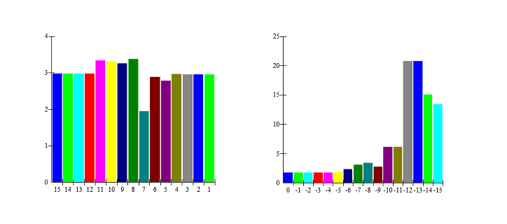
The aim here is not to test the CCI system, but to see how the Delphic TradeStation Value charts can be used to increase the reliability of the signals it generates. For this reason we are going to optimise one of the system’s inputs to ensure that the initial system produces strong results. The chart below shows the effects of optimising the ‘length’ parameter of the CCI within a range of values from 5 to 20. The chart on the left shows the effect on profitability, and that on the right shows the effect upon the profit factor:
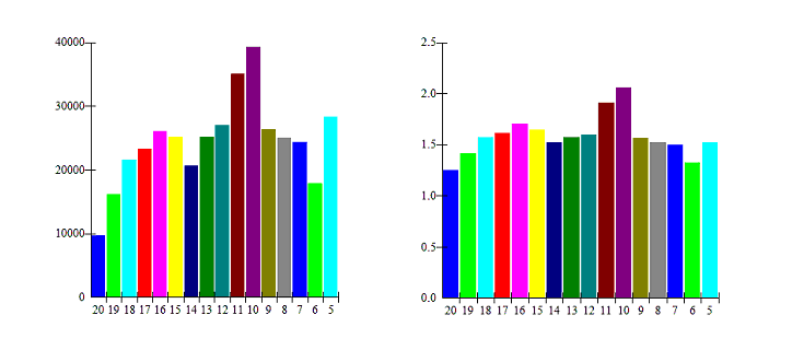 |
A look-back setting of 10 gives the most profitable results over ten years of trading the E-Mini S&P500 futures contract. Note that the 10 period setting outperforms all others by a considerable amount, suggesting that to some degree it is simply a good ‘fit’ to this specific data. Reassuringly, however, all the parameters tested produced acceptable profits, and the optimal input of 10 sits in the middle of a peak area of profitable values – one of these neighbouring values is probably a more accurate prediction of the type of results that could actually be achieved going forwards.
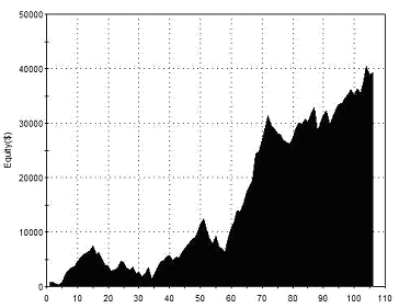
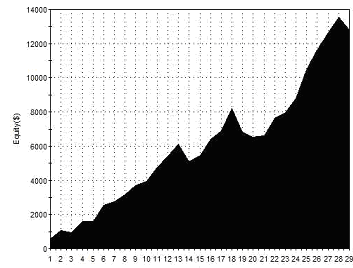
The length of the moving average could also be optimised, as could the overbought and oversold levels of the CCI, along with the indicator levels used for exits. Doing so would almost certainly result in over-optimisation, so we’ll avoid this. With a ‘length’ setting of ‘10’ then, and all other parameters left as described above, the system would have performed as follows:
 |
Total Net Profit Profit Factor Long Profit Factor Short Profit Factor Total Trades Percent Profitable Avg Trade Net Profit Maximum Drawdown |
$39,250 2.06 1.59 3.01 106 65.09% $370.28 $8,725 |
| Performance Report – CCI Basic Strategy – @ES – Daily Bars – 17/01/2002-16/01/2012 | ||
We can now introduce the first filter rule using the TradeStation Value charts. Short entries will only be taken when the Value charts shows an overbought reading with a high greater than +8, and long entries when the indicator shows an oversold reading with a low of less than -8. The results of introducing this filter are as follows:
 |
Total Net Profit Profit Factor Long Profit Factor Short Profit Factor Total Trades Percent Profitable Avg Trade Net Profit Maximum Drawdown |
$14,400 3.43 2.84 14.46 28 67.86% $514.29 $4,062 |
| Performance Report – CCI with Value Chart Entries – @ES – Daily Bars – 17/01/2002-16/01/2012 | ||
As you can see, the number of trades has dropped by over two thirds, and the profit achieved has been more than halved. Remember, however, that we’re interested in improving the reliability of the system’s signals, not just ramping up the frequency of trading to give a greater net gain. The best simple metric for measuring this is the profit factor; this has improved considerably from 2.06 to 3.43. In practice then, if we were to extrapolate this performance to the same number of trades as the basic system took, then we would achieve a total net profit of $54,514 – a very worthwhile improvement!
By introducing the Value Charts we have also introduced a further set of variable parameters into the system. The improvement in performance occurs without any optimisation of the parameters, but this may well be because we have been lucky enough to stumble upon the optimal historical parameters. Due diligence here demands that we examine the results of varying the parameters to ensure that the performance isn’t wildly diminished. The two charts below show the effects on the profit factor of varying both the overbought and oversold levels of the indicator.
 |
Although optimising based on this asymmetry would be perfectly reasonable here in the ES it would not be a valid approach elsewhere, and we want our strategy to work in other markets. Also, though an oversold setting of -12 has a massive profit factor of 20.75, it also generates only 8 trades in 10 years, which is a little too infrequent to be of any interest to most.From these results we can see that changes to the overbought level do not significantly impact upon the performance of short positions, but that the performance of long positions is quite sensitive to the oversold level setting. This kind of asymmetry is what we could safely expect with a stock index, where a large proportion of both institutional and retail traders are buy-side only, and will become involved in greater numbers the more a market becomes oversold.
As well as exiting long positions when the CCI closes above 0, we can also exit long positions when the TRADESTATION Value charts closes above 0. The opposite will apply for short positions, which will be exited when the Value charts closes below 0. In this way we are employing the TradeStation Value Charts as a ‘failsafe’ mechanism: if the CCI fails to respond to an important price change and generate an exit signal, then we look to the Value Chart to do so instead.
 |
Total Net Profit Profit Factor Long Profit Factor Short Profit Factor Total Trades Percent Profitable Avg Trade Net Profit Maximum Drawdown |
$12,812 4.60 4.02 20.04 29 82.76% $441.81 $3,062 |
| Performance Report – CCI with Value charts Exits – @ES – Daily Bars – 17/01/2002-16/01/2012 | ||
We know that a market that has reached over-extended levels is unlikely to continue much further in its current direction. We can make use of this knowledge by examining the state of the TRADESTATION Value charts in a higher timeframe. Using the basic CCI strategy, but with the additional rule that we will only accept long signals when the TRADESTATION Value charts gives a reading less than +8 on the weekly chart, and shorts when the reading is greater than -8.
 |
Total Net Profit Profit Factor Long Profit Factor Short Profit Factor Total Trades Percent Profitable Avg Trade Net Profit Maximum Drawdown |
$33,887 2.28 1.84 2.72 65 64.62% $521.35 $6,587 |
| Performance Report – CCI with Weekly Value Charts Filter – @ES – Daily Bars – 17/01/2002-16/01/2012 | ||
Understanding the “Expectatunity” Concept
This strange portmanteau word has been used by trading psychologist Dr Van Tharp to describe a crucial but often misunderstood concept amongst traders. When selecting a system, with the ultimate aim of making as much money as possible, you need to consider two things:
- Expectancy – or how well the system performs
- Opportunity – how frequently the system trades
Assuming that two systems have an identical edge in the market, both having a profit factor of 2.2 and a 75% win rate, for example, then we should select the system that trades with the highest frequency. The more trades that the system generates, the more opportunity exists for the system’s edge to play out and generate profits.
Unfortunately the markets demonstrate a frustrating knack for keeping these two elements in inverse proportion; as opportunity increases, expectancy typically decreases, and visa-versa. In our case the revised system above has a very high expectancy, but trades fairly infrequently (about twice a year). This is why, although it has a much higher expectancy than the initial basic CCI system, it doesn’t generate nearly as much profit within the ten year test period.
Pro-Trader Tips
If you’re considering shorting an up-trending market just because the Value charts shows an overbought level, then consider the following adage: ‘A bear market knows no support, and a bull market knows no resistance’.
In a true bull or bear market there is no such thing as an overbought or oversold level. Always look to enter on short corrections back in the direction of the long term trend.
If you sometimes have trouble maintaining the discipline to sit through adverse moves against your position where your trading system requires this, then look for divergence signals for reinforcement.
Often once you’ve entered and price moves initially against you, as it does so there will be clear divergence between price and the value charts – an encouraging reason to sit tight and stick with your strategy.
“Utilizing Value chartss, traders can now create trading systems that have
the ability to enter or exit the market at relative price levels intraday”
David Stendahl –
Creator of Value Charts
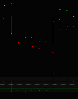
Detecting Buy and Sell Program Patterns
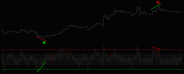
This is a highly discretionary pattern for day-traders, and should be combined with other signals for confirmation.
At the point marked A, the market rallies to an overbought level, indicating the presence of buyers, and then begins to sell off. Notice how quickly the market falls to an extreme low – the speed of this movement is important as it indicates a ‘sell program’ eating through all the available liquidity.
At the point marked B the market reaches an oversold level. Regardless of how much the program seller needs to short, they will be reluctant to do business at such low prices when buyers demonstrated their willingness to buy at much higher prices only 5 bars before.
Only above fair value will the program seller be likely to re-enter. This is the time to establish a long position in the anticipation of a move back to fair value. The exits shown are when price trades back to prior highs – where the seller may re-enter.
Here are some ideas for ways to develop this approach:
- The key to using this type of pattern is to understand what other market participants are doing and why. This means acknowledging that others trade with very different agendas and horizons across diverse timeframes; who is controlling the market right now, are the liquidating or establishing a position, and who is sitting on the sidelines?
- Trade only with the longer term trend – the idea is to catch the only sell program on a day of buy programs, or visa versa.
- Sometimes a series of extreme readings can persist throughout an entire session, with trading remaining choppy but volatile. You could use a market regime approach to isolate choppy, range-bound days from trending days.
- Look for the pattern to set up around the time of news events – for participants concerned with longer term fundamentals, such events will often lead to the re-balancing of a portfolio.
- Buy and Sell Programs necessitate large trading volumes. If you don’t see volume ramp up then you’re probably not witnessing institutional activity.
- Look for buy and sell programs to trigger around areas of support and resistance (such as those marked on the chart above) – these lines are manifestations of supply and demand.
Using the Built-in Average Function in Delphic Value Charts
Entering ‘True’ next to ‘AverageOn’ in the indicator’s ‘Inputs’ tab will cause a moving average of the closing price of the Value charts to be plotted. The lookback length of the average defaults to the same as the lookback length used in the Value charts algorithm.
The following is a swing trading strategy that uses the Value charts Average to trade short term thrusts, and is not dependent upon the long term direction of the market.
The requirements for a long entry are as follows (rules are reversed for short entries):
- The prior close of the Value charts is above the current Value charts Average.
- The current close of the Value charts is below the current Value charts Average.
- The current close of the Value charts is below zero.
- The current Price close is lower than the prior two closes.
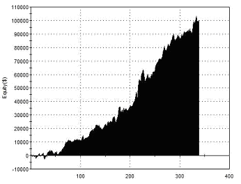
Here are the results trading a single contract of the E-Mini S&P500 futures:
 |
Total Net Profit Profit Factor Long Profit Factor Short Profit Factor Total Trades Percent Profitable Avg Trade Net Profit Maximum Drawdown |
$42,262 1.53 1.57 1.50 483 44.93% $87.50 $5,187 |
| Performance Report – Value Chart Averages – @ES – Daily Bars – 17/01/2002-16/01/2012 | ||
 All the trades in the test above were exited after the position was held for one full day then exited on the close.
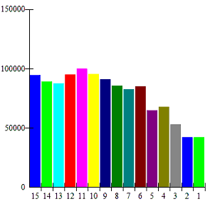
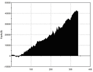
The chart on the right shows the effect of longer holding periods of up to 15 days on the net profit of this strategy. Note that as holding periods become longer, many trades will be exited due to natural system reversals when a position is entered in the opposite direction. Also, it should be noted that as the position is held for a longer period, the size of the maximum adverse excursions that must be endured will almost certainly also increase.
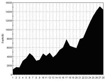
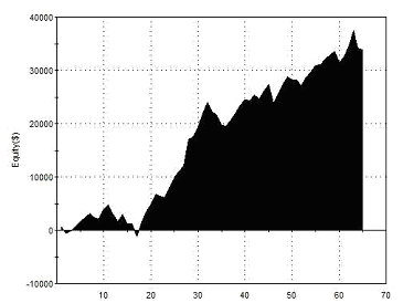
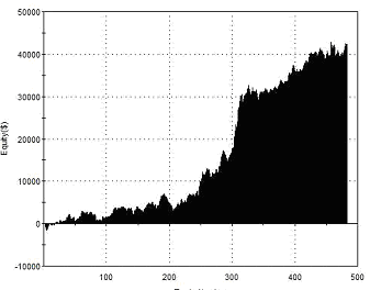
The chart above shows that the optimum return in the test period would be achieved with an 11 day holding period. Here are the results of testing with this exit:
 |
Total Net Profit Profit Factor Long Profit Factor Short Profit Factor Total Trades Percent Profitable Avg Trade Net Profit Maximum Drawdown |
$100,000 1.81 2.12 1.57 339 67.26% $295.17 $20,487 |
| Performance Report – Value Charts Averages 11 Day Exit – @ES – Daily Bars – 17/01/2002-16/01/2012 | ||
The strategy requires that the Value charts closes above zero for short entries, or below zero for long entries. Based on what we already know about what Value chartss reveal, this ensures that there is enough ‘headroom’ for price to move before it stalls at overbought or oversold levels. It ensures that we don’t enter a long position when the indicator is overbought, just because it happens to cross below its average.
Because this approach derives its edge from short term reversions to the mean, and is not really dependent on the long term trend, one intelligent way that it could be deployed is as a ‘smoothing’ tool for longer term trend-following type strategies. Once a long position has been established according to a trend-based model, counter-trend entries generated by the strategy above could be initiated using a highly correlated instrument or a separate account.
Using Value Charts with Range Breakouts
It’s important to always remember that indicators like the Value Charts are just applying a mathematical process to price data in order to make some particular aspect of that data more obvious to us. Once you understand this you can begin to apply indicators appropriately and intelligently.
The Value charts is simply intended to display relative value. In all the studies above we focussed on how this can be used to identify overbought and oversold conditions and provide low risk entries. Really though, this is only appropriate when trading a market that is likely reject such levels; once in breakout mode, many markets can remain at overbought or oversold levels on an indicator for sustained periods.
The following strategy uses a Value charts reading to identify sustained price movements in the EUR/USD currency pair, and then combines this filter with a simple range breakout for entry.
 On a daily chart the Delphic Value Chart is added, along with a 3 day average of the range.
When the Value charts closes above a threshold of 2 or more at the end of the trading day, a buy stop order is placed above the current days high at a distance of half the average range of the past 3 days. This is shown on the right by a green dot. A stop-loss is placed at the current days high.
Sell stop orders are placed at half the average range of the past 3 days below the current low when the Value charts closes below -2. This is shown by a red dot on the chart to the right. A stop-loss order is placed at the current day’s low.
All positions are exited on the close of the day of entry, whether for a profit or a loss.
The performance for this basic approach combining range breakouts with the Value charts reading is as follows:
 |
Total Net Profit Profit Factor Long Profit Factor Short Profit Factor Total Trades Percent Profitable Avg Trade Net Profit Maximum Drawdown |
$42,018 1.83 1.86 1.79 338 57.40% $124.31 $4,878 |
| Performance Report – Range Breakouts – EUR/USD – Daily Bars – 22/01/2002-29/02/2012 | ||
There’s not a lot wrong with this, but it would be good to see if we could improve the average trade profit and perhaps reduce the drawdown a little without affecting the other parameters. One possibility is the addition of a longer term trend filter such as a simple moving average.
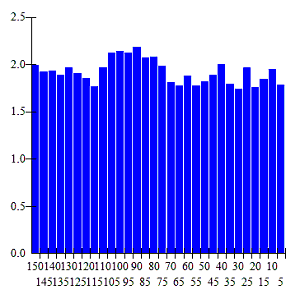
The metrics using an 80 period SMA are shown below – this is the optimal look-back length for improving the profit factor as opposed to net profitability over the sample data, but as the chart below left demonstrates, there is little variation in the profit factor regardless of the MA length used:
 |
Total Net Profit Profit Factor Long Profit Factor Short Profit Factor Total Trades Percent Profitable Avg Trade Net Profit Maximum Drawdown |
$32,750 2.19 2.29 2.03 221 58.37% $148.19 $2,452 |
| Optimised Performance Report – Breakouts with MA Filter – EUR/USD – Daily Bars – 22/01/2002-29/02/2012 | ||
Although the overall net profit has fallen with the addition of this filter, it should be obvious that every other metric has improved quite substantially. Most pleasing of all is a 50% reduction in the drawdown.
If you wanted to experiment with further developments to this basic strategy then the next obvious thing to examine would be the exits – a quick preliminary test indicates that holding profitable positions for an additional day can boost profits to $35,155 with a profit factor of 2.38.
The code for the basic strategy with the MA filter provided below.
{ TradeStation 9.0 EasyLanguage Strategy Code }
{ Range Breakouts with Value charts and SMA Filter for EUR/USD Daily Bars }
If TRADESTATIONValueChart>2 and average(c,90)>average(c,90)[1] then
Buy next bar at h+(0.5*avgtruerange(3)) stop;
If TRADESTATIONValueChart Sellshort next bar at l-(0.5*avgtruerange(3)) stop;
Buytocover next bar at l stop;
Sell next bar at h stop;
If Barssinceentry=1 then
Setexitonclose;
Value Charts Indicator
|