In this article we will attempt to create a simple volatility indicator and then test its predictive capabilities to determine whether it could provide us with any kind of tradeable edge.
The market characteristic that we call volatility, which all traders and investors quickly learn to recognise when they encounter it, is actually a somewhat vague term and there is no one single way in which it can be defined quantitatively.
Among the most simple and widely used methods to measure volatility are standard deviation and the average true range. Whilst these are two different approaches, and standard deviation might be described as more properly a “statistical” measure than the average true range, they also both use completely different inputs.
The average true range (with the exception of gaps) is concerned with the range – the difference between the session high and low – whereas standard deviation is calculated using any single aspect of the data series, typically the close, although the standard deviation of the open, high, low, or midpoint could just as easily be calculated.
Different Ways to Measure Volatility
When we think about how each of these works, it’s clear that they’re each measuring something subtly different. Standard deviation of the close is more reactive to directional volatility, whereas the average true range is completely agnostic in that respect, and captures the extent of price change within a period, regardless of whether the market was able to follow through on this change. If we reduce the number of data points used in each calculation (or the length settings of the indicators incorporating them) towards the minimum, then the difference is made even more apparent. Consider the three candlesticks below:
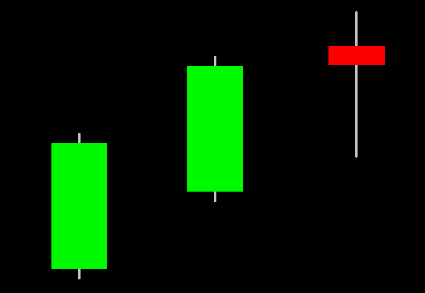
The range of each is identical. There’s no difference whatsoever between the 2-period average true range calculation for the first and second, and the second and third candles. However, the distance from close to close is pronounced in the first two candles, and then reduces sharply with the third candle, meaning that the standard deviation between the first and second, and the second and third candles, decreases.
It’s the difference between these two calculation methods which provides the 2 estimations of volatility that you’ll find in the Delphic Squeeze indicator.
Creating A Short Term Volatility Indicator
In this article, I wanted to explore what is surely the simplest method of measuring volatility: the range. Unlike the average true range, this measure doesn’t make changes to incorporate gaps or overnight price action. This means that, for each period, only the high and low are used.
As we have identified, this tells us nothing about the market’s ability to follow through on the changes which were seen during a given period. If the high is 150 and the low is 135 on two days, then they share the same range of 15, even though the first day may have opened at 135 and closed at 150, whereas the second might have opened at 135 and closed at 135, having realised no actual gains on the day.
We have, therefore, a second measure available to us here – the difference between the opening and closing prices – which contrasts with the range in that it tells us something about how well the market was able to maintain and solidify the directional changes it underwent. I want to see whether we can build any type of indicator, or even a simple trading system, around these two measures.
I’ve dubbed them ‘HLrange’, which is the traditional range measured as the distance between the high and low, and ‘OCrange’, which is the difference between the open and close. We don’t want to return negative figures for the OCrange when the close is below the open because the HL range is never a negative figure (as a consequence of the fact that the high can never be less than the low). OCrange is therefore defined as the absolute value, as follows:
OCrange = Absvalue ( Open – Close )
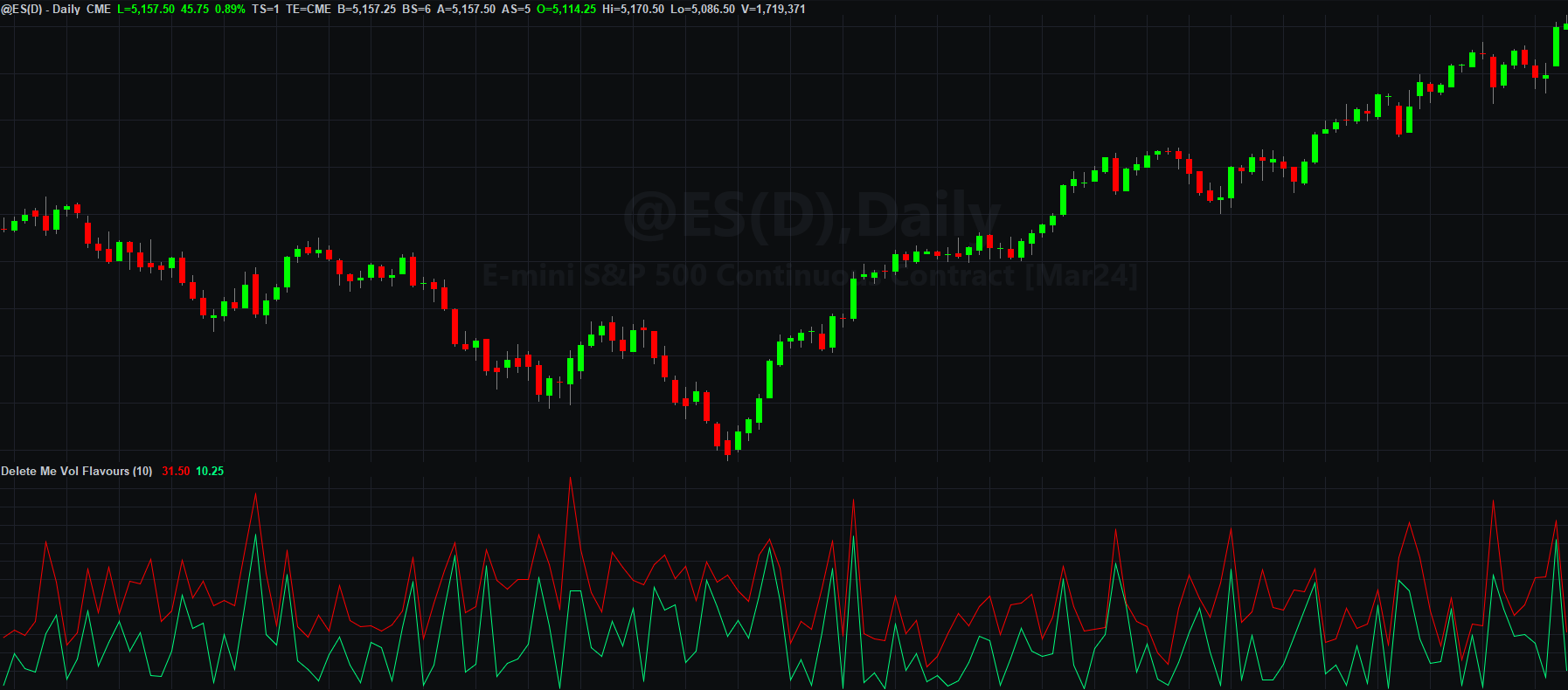
On the chart below, I’ve plotted both these measures. HLrange is represented by the red line, and OCrange is represented by the green line.
Let’s start with a few observations of features which are necessarily true, and which don’t tell us anything meaningful:
- When OCrange is large, then HLrange is also large; this is always true because the open and close can never be higher or lower than the high and low of the session.
- OC range is always less than or equal to HLrange; this is true by definition because the difference between the open and close can never exceed the difference between the high and low.
Moving on to less facile observations, we can see that there appear to be periods where the two measures are similar (where price successfully maintained the gains or losses from the open through to the close of the session), and periods where they differ (where a high and low were made, but then price closed near to where it opened).
We can visualise this better if we plot the difference between the HLrange and the OCrange:
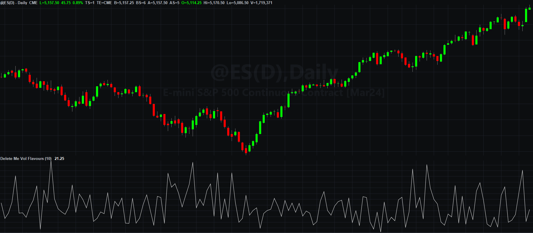
A relatively high reading from this simple indicator will correspond with candles with large wicks but small real bodies, whereas relatively low readings will correspond with small wicks and large real bodies.
Adding Bands to Identify Extreme Behaviour
How can we use this to predict future price behaviour?
Like with most market characteristics, the answer is to look to exploit extreme behaviours. We can do this in one of two ways:
- Look for evidence of mean reversion, assuming that when the behaviour is extreme by some relative measure, this situation cannot be sustained, and the behaviour will revert back towards its typical or average behaviour.
- Look for evidence of auto-correlation, assuming that periods of self-similar behaviour will occur (trends in the behaviour), and that a tendency in the direction of one form of behaviour is more likely to persist for a time than not.
Let’s start with the first of these. To our simple indicator, we’ll add a 10 period average, and then bands above and below this showing 2 standard deviations over that same 10 periods. Here’s what this looks like:
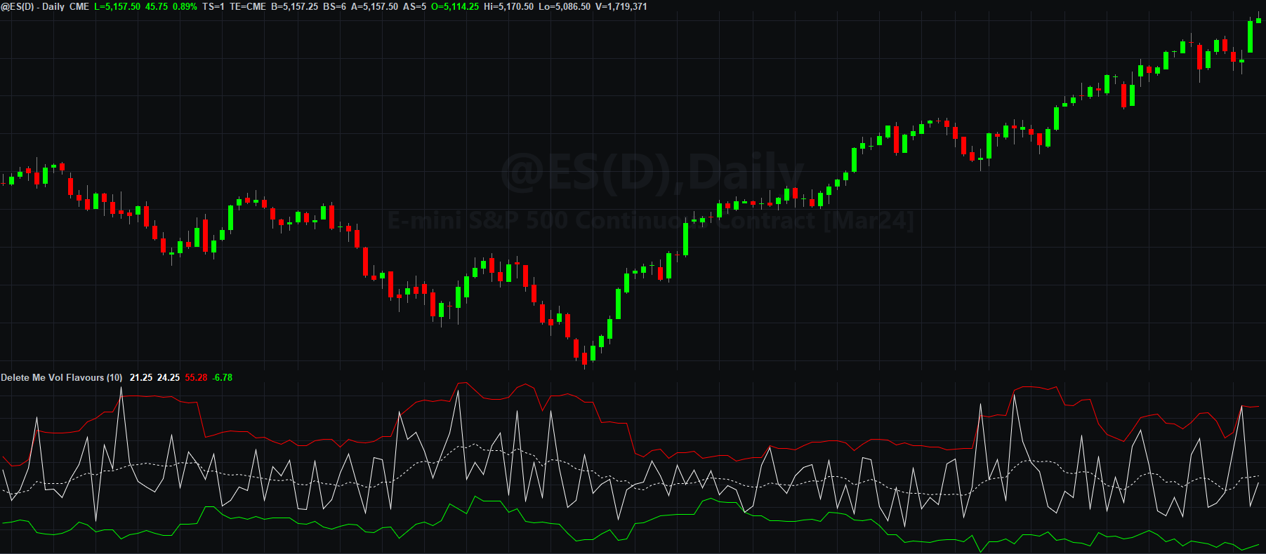
We can see a number of instances where our indicator gives a relatively high reading, close to or above the red band, and then immediately reverts back towards the average (or even below it), and as we would expect this corresponds with a strong trend day. We are, of course, looking at a very limited sample here. To test this further and see whether this relationship holds in any meaningful way, we need to look at more data, which is what I did . . .
Assessing the Predictive Capabilities of the Volatility Indicator
Over the past 20 years of data, for the ES daily session (including the Globex or overnight session), where our indicator closed above the upper band, then the next day it closed at or below its average 45.16% of the time. That’s certainly not a result that implies a mean-reverting property. In fact, it indicates a tendency towards auto-correlation.
Now let’s look at the reverse scenario. Over the past 20 years, where our indicator closed below the lower band, the next day it then closed at or above its average 32.00% of the time. It’s important to note that there were only 25 instances of this happening during the 20 years. This is because an extreme low reading from our indicator will typically correspond to the market opening on its low and closing on its high, which is not a common occurrence. In fact, this exposes an asymmetry in the indicator; it’s bounded to the downside, but not to the upside (the wicks of a candle can theoretically be infinitely large, but they cannot be smaller than zero). We’ll just ignore this for now.
Of course, we are imposing quite a strict criteria here in that we’re requiring that the reversion occurs during the very next period. We can extend this somewhat by asking about the indicator’s behaviour two days out, instead of one (and discarding the intermediate day). Where our indicator closed above the upper band, then the next-day-but-one, it closed at or below its average 45.13% of the time. And where our indicator closed below the lower band, then the next-day-but-one, it closed at or above its average 48% of the time.
None of this is to say that where the indicator closed outside of the bands, it didn’t close back inside them the following day. But we can ask that question too. When the indicator closed above the upper band, then the next day it closed back inside the bands 92.63% of the time. And when it closed below the lower band, the next day it closed back inside the bands 96% of the time;
From this, we can conclude that our indicator will tend to revert towards its mean, but is unlikely to swing from an extreme reading directly to an average one within the next few session. The question would therefore be whether the swings are sufficient to give us any type of market edge.
What Direction Would We Trade In?
Even if we had a high conviction in a reversion towards the mean, how would we trade from this? The indicator is only only telling us about the difference between our two measures of volatility, and nothing about market direction. Let’s consider this in terms of an example:
Suppose that our indicator closes at an extreme high level. This is telling us that the real body (OCrange) is relatively small compared to the range (HLrange). In the next session, we can expect the real body to more closely resemble the range, which is to say that we can expect the market to open and close closer to its high and low. But it’s not telling us anything about what that will look like in terms of the direction of the market movement. When the market opens, do we expect that this will remain close to the low, with the market rallying all day, or close to the high, with the market falling all day?
The traditional squeeze indicators attempts to solve this by using a directional momentum indicator to tell us which direction we should expect the market to move in, although how successful this is will depend on the efficacy of that directional indicator. Moreover, the squeeze usually deals with volatility and direction over longer, more predictable periods; our indicator above is concerned only with what might happen the next day.
The reverse scenario seems a little easier to exploit. Where the indicator closes at a relatively extreme low value, telling us that the real body accounted for almost all of the session’s range, then the following session we can expect that the range will account for less of the range. This means that, once something like the average range has been achieved, we could bet against a close which maintains this. If the market opened near its lows, and rallied to a high around the average range, then we can bet that it won’t sustain that high into the close.
This is misguided though. What we’d be doing is stacking a number of mediocre probabilities around a number of low-frequency events. If the market didn’t open near its low, but rather had already put in place a long lower wick before rallying, then the ratio of real body to range will already have changed to give the increased reading predicted by our indicator, even if the market goes on to close near its high. The number of times an extreme low reading occurs is small. The number of times we can be sure the market opened near its lower is small. And our confidence in any predictor of the average range that we can expect (an entirely different problem), is small.
Trading Volatility Products
One answer to the general problem posed by the lack of directional information contained in a volatility indicator is to trade volatility products instead of making directional trades in the underlying market. Instead of trading the ES, for example, we could trade the VIX volatility index futures.
This is certainly a valid idea worth returning to, but only once we have equipped ourselves with a robust and effective method for predicting volatility, and this doesn’t seem to be something that can be achieved through our indicator above.
I intend to explore this in a future article, where we’ll abandon the (needlessly?) complex methodology above, and instead focus on some very simple methods of predicting volatility using just a single measure such as the range, alongside information about the balance of buyers and sellers in the market.
For now though, although we haven’t arrived at anything above that we can use directly to trade with, we have seen how an idea can be explored conceptually as well as tested quantitatively using TradeStation, and how unproductive lines of enquiry can quickly be weeded out and discarded when developing strategies.